
Vedmack
-
Content count
51 -
Joined
-
Last visited
Posts posted by Vedmack
-
-
Thanks!
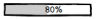
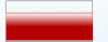
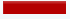
Almost there, now it looks like this:
 , I modified the code to be almost like yours - I could not make it exactly the same becausse I complains that It can't find the id (dunno why because it does find it with the way I call the API)
see updated code:
chartData = {
            "chart": {
                "showValue": "1",
                "bgAlpha": "0",
                "showBorder": "0",
                "lowerlimit": "0",
                "upperlimit": "100",
                "numbersuffix": "%",
                "baseFontSize": "13",
                "canvasPadding": "0",
                //Will change the color of Plor
                "plotFillColor": fillColor,
                //Will change the color of Base Font - Value(67%)
                "baseFontColor": fillColor,
                "canvasRightMargin": "40",
                "showTickMarks": '0',
                "showTickValues": '0'
            },
            "annotations": {
                "groups": [
                    {
                        "id": "Grp2",
                        "items": [
                            {
                                "type": "rectangle",
                                "x": "$gaugeStartX",
                                //to align with value of Plot.
                                "y": "$gaugeStartY + 9",
                                "tox": "$gaugeEndX",
                                //to align with value of Plot.
                                "toy": "$gaugeEndY - 9",
                                "radius": "3",
                                "alpha": "50",
                                //set background color to gray
                                "fillColor": "#dce0e5"
                            }
                        ]
                    }
                ]
            },
            "value": scope.value
        };

        chartReference = new FusionCharts("HBullet", genChartId, placeHolderWidth, placeHolderHeight, "0", "0");
        chartReference.setJSONData(chartData);
        chartReference.setTransparent(true);
        chartReference.render(scope.chartWrapperId);
How can I make it make the gray background to have the same height as the colored bar itself?
Thanks again
-
Hi,
I need my HBullet to look like this:
 , and I was wondering on how can I achive it?
I want my chart to have rounded corners and I want a gray backgroung of the horizonatl (100%) bar , last thing is that I want to control the color and the size of the value
my current chart data is as follows
chartData = {
            "chart": {
                "showValue": "1",
                "bgAlpha": "0",
                "showBorder": "0",
                "lowerlimit": "0",
                "upperlimit": "100",
                "numbersuffix": "%",
                "animation": "1",
                "plotfillcolor": fillColor,
                "canvasRightMargin": "40",

                "showTickMarks": '0',
                "showTickValues": '0'
            },
            "colorrange": {
                "color": [
                    {
                        "minvalue": "0",
                        "maxvalue": "100",
                        "alpha": "0"
                    }
                ]
            },
            "annotations": {
                "groups": [
                    {
                        "id": "Grp2",
                        "showbelow": "1",
                        "items": [
                            {
                                "type": "rectangle",
                                "x": "$gaugeStartX",
                                "y": "$gaugeStartY",
                                "tox": "$gaugeEndX",
                                "toy": "$gaugeEndY",
                                "alpha": "0",
                                "showBorder": "1",
                                "borderAlpha": "100",
                                "borderColor": fillColor
                            }
                        ]
                    }
                ]
            },
            "value": scope.value
        };
Thanks ahead
Tthis is how my chart currently looks like:

And this is how I want it to look

-
After upgrading from /3.2.4-sr1.9888 to the new version 3.4.0 the value that is shown below the angular chart is being displayed too close to the chart (see attached screenshot) and all I did is to replace the js files (removed all the old ones)
-
Hi,
Until recently I was using the "old" style API initialization, like this:
			chartReference = new FusionCharts("Pie2D", "os_chart_id", placeHolderWidth, placeHolderHeight, "0", "0");
			chartReference.setJSONData(chartData);
			chartReference.setTransparent(true);
			chartReference.render("os_kpi_container");
Now I want to use the new one (I downloaded the latest js files)
			chartReference = new FusionCharts({
			        type: 'pie2d',
				renderAt: 'os_chart_id',
				width: placeHolderWidth,
				height: placeHolderHeight,
				dataFormat: 'json',
				dataSource: chartData
				});

			chartReference.setTransparent(true);
			chartReference.render("os_kpi_container");
BUT, it generates a slightly bigger pie chart and while it is doing the animation its even bigger (while the animation is being animated) which add a vertical scroll to my page (because the pie chart is located near the bottom of the screen)
What am I missing ? How I put the "0", "0" that I did set in the old API
Thanks ahead!
Daniel.
-
The canvasRightMargin did the trick, thanks!
Where can I get the latest FusionCharts Suite XT version (currently using the 3.2.4-sr1.9888) ? Our Account Manager at FusionCharts doesn't seems to respond via email...
-
Hi
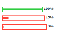
First take a look at the charts in the screenshot , you will notice that their sizes are different ( <-- bad for me)
I noticed that a bullet chart with value = 100 will display a smaller chart than a chart with value 90, apparently because the "100" string take more spaces and the "90" chart will be smaller than a value= "3"
Here is my code:
        chartData = {
            "chart": {
                "bgAlpha": "0",
                "showBorder": "0",
                "lowerlimit": "0",
                "upperlimit": "100",
                "numbersuffix": "%",
                "animation": "1",
                "plotfillcolor": fillColor,

                "showTickMarks": '0',
                "showTickValues" : '0'
            },
            "colorrange": {
                "color": [
                    {
                        "minvalue": "0",
                        "maxvalue": "100",
                        "alpha": "0"
                    }
                ]
            },
            "annotations": {
                "groups": [
                    {
                        "id": "Grp2",
                        "showbelow": "1",
                        "items": [
                            {
                                "type": "rectangle",
                                "x": "$gaugeStartX",
                                "y": "$gaugeStartY",
                                "tox": "$gaugeEndX",
                                "toy": "$gaugeEndY",
                                "alpha": "0",
                                "showBorder": "1",
                                "borderAlpha": "100",
                                "borderColor": fillColor
                            }
                        ]
                    }
                ]
            },
            "value": scope.value
        };

        chartReference = new FusionCharts("HBullet", genChartId, placeHolderWidth, placeHolderHeight, "0", "0");
        chartReference.setJSONData(chartData);
        chartReference.setTransparent(true);
        chartReference.render(scope.chartWrapperId);
How can I make them all take the same space ?
Its important for me to display the value at the left side of the chart, and it should be vertically centered <-- how can I make vertically centered? because right now it is not which doesn't look so good
Thanks ahead,
Daniel.

-
Hi
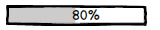
I'm trying to make the linear gauge to look like the first attached image (rectangle with border and filled with color till some point and with value placed in the center of it)
This is what I have managed to do (second attached image)
chartData = {
	"chart": {
		"manageresize": "1",
		"origw": "420",
		"origh": "90",
		"lowerlimit": "0",
		"upperlimit": "100",
		"numbersuffix": "%",
		"showborder": "0",
		"bgcolor": "FFFFFF",
		"showgaugeborder": "0",
		"pointerontop": "0",
		"pointerradius": "5",
		"pointerbordercolor": "000000",
		"pointerbgcolor": "000000",
		"annrenderdelay": "0",
		"showshadow": "0",
		"minortmnumber": "0",
		"basefontcolor": "000000",
		"animation": "1",
		"showTickMarks": '0',
		"showTickValues" : '0'
	},
	"colorrange": {
		"color": [
			{
				"minvalue": "0",
				"maxvalue": "100",
				"alpha": "0"
			}
		]
	},
	"pointers": {
		"pointer": [
			{
				"value": "62"
			}
		]
	},
	"annotations": {
		"groups": [
			{
				"id": "Grp2",
				"showbelow": "1",
				"items": [
					{
						"type": "rectangle",
						"x": "$gaugeStartX",
						"y": "$gaugeStartY",
						"tox": "$gaugeEndX",
						"toy": "$gaugeEndY",
						"fillcolor": "E00000,FCEF27,678000"
					}
				]
			}
		]
	}
};

chartReference = new FusionCharts("HLinearGauge", "license_chart_id", 300, 100, "0", "0");
chartReference.setJSONData(chartData);
chartReference.setTransparent(true);
chartReference.render("license_kpi_container");
Help will be appreciated.
Daniel.

-
Just wanted to update you that its a bug in firefox and a workaround would be to use
helper: "clone"
inside sortable constructor
-
Thanks!
Helped indeed...
-
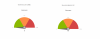
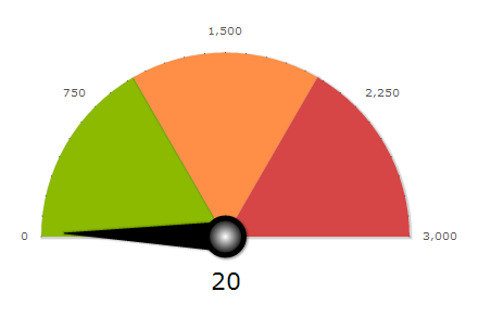
Hi ,
I wanted to remove the tick marks from the AngularGauge , so I set showTickMarks to 0 , but there seems to be some leftovers around the chart...
How can I remove them ?
Here is my code:
var chartData = {
			"chart": {
				"showTickMarks" : "0",
				"showTickValues" :'1',
				"gaugeFillMix" : "",

				"manageresize": "1",
				"animation" : "0",
				"managevalueoverlapping": "1",
				"autoaligntickvalues": "1",
				"fillangle": "45",

				"upperlimit": max,
				"lowerlimit": "0",

				"majortmheight": "8",

				"showgaugeborder": "0",
				"gaugeinnerradius": "2",
				"formatnumberscale": "0",
				"decmials": "0",
				"tickmarkdecimals": "1",

				"pivotradius": "17",
				"showpivotborder": "1",
				"pivotbordercolor": "000000",
				"pivotborderthickness": "5",
				"pivotfillmix": "FFFFFF,000000",

				"tickvaluedistance": "10",
				"showvalue": "1",
				"borderalpha": "0",
				"bgAlpha" : '0',
				"valueBelowPivot" : "1",
				"majorTMNumber" : "5",
				"minorTMNumber" : "6",
				"tickValueDecimals" : "0",
				"decimals" : "0"
			},
			"colorrange": {
				"color": [
					{
						"minvalue": 0,
						"maxvalue": slice,
						"code": "8BBA00"
					},
					{
						"minvalue": slice,
						"maxvalue": slice + slice,
						"code": "FF8E46"
					},
					{
						"minvalue": slice + slice,
						"maxvalue": max,
						"code": "D64646"
					}
				]
			},
			"dials": {
				"dial": [
					{
						"value": parseInt($('input[id$="license_widget_data_out"]').val()),
						"borderalpha": "0",
						"bgcolor": "000000",
						"basewidth": "28",
						"topwidth": "1",
						"radius": (placeHolderWidth / 2 - 70)
					}
				]
			},
			"styles": {
				"definition": [
				    {
					    "type": "font",
					    "name": "myAngularGaugeSpecialFont",
					    "color": "000000",
					    "size": "22"
				    }
				],
				"application": [
				    {
					    "toobject": "Value",
					    "styles": "myAngularGaugeSpecialFont"
				    }
				]
			}
		};

		chartReference = new FusionCharts("AngularGauge", "license_chart_id", placeHolderWidth, placeHolderHeight, "0", "0");
-
It did helped!
Thanks!
-
Hi
How can I disable the gradient effect on my AngularGauge chart ?
If you'll take a close look on the attached picture , you'll notice that the color of the slices become whiter when the comes near the center of the Gauge
			var chartData = {
			"chart": {
				"manageresize": "1",
				"animation" : "0",
				"managevalueoverlapping": "1",
				"autoaligntickvalues": "1",
				"fillangle": "45",

				"upperlimit": max,
				"lowerlimit": "0",

				"majortmheight": "8",

				"showgaugeborder": "0",
				"gaugeinnerradius": "2",
				"formatnumberscale": "0",
				"decmials": "0",
				"tickmarkdecimals": "1",

				"pivotradius": "17",
				"showpivotborder": "1",
				"pivotbordercolor": "000000",
				"pivotborderthickness": "5",
				"pivotfillmix": "FFFFFF,000000",

				"tickvaluedistance": "10",
				"showvalue": "1",
				"borderalpha": "0",
				"bgAlpha" : '0',
				"valueBelowPivot" : "1",
				"majorTMNumber" : "5",
				"minorTMNumber" : "6",
				"tickValueDecimals" : "0",
				"decimals" : "0"
			},
			"colorrange": {
				"color": [
					{
						"minvalue": 0,
						"maxvalue": slice,
						"code": "399E38"
					},
					{
						"minvalue": slice,
						"maxvalue": slice + slice,
						"code": "E48739"
					},
					{
						"minvalue": slice + slice,
						"maxvalue": max,
						"code": "B41527"
					}
				]
			},
			"dials": {
				"dial": [
					{
						"value": 55,
						"borderalpha": "0",
						"bgcolor": "000000",
						"basewidth": "28",
						"topwidth": "1",
						"radius": (placeHolderWidth / 2 - 70)
					}
				]
			},
			"styles": {
				"definition": [
				    {
					    "type": "font",
					    "name": "myAngularGaugeSpecialFont",
					    "color": "000000",
					    "size": "22"
				    }
				],
				"application": [
				    {
					    "toobject": "Value",
					    "styles": "myAngularGaugeSpecialFont"
				    }
				]
			}
		};

		chartReference = new FusionCharts("AngularGauge", "someID", placeHolderWidth, placeHolderHeight, "0", "0");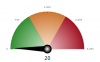
-
Thanks , showPlotBorder did the job
-
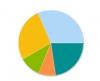
Here is a sample code
var chartData = {
   "chart": {
       "showlabels": 0,
       "showvalues": 0,
       "showLegend": 1,
       "legendPosition": "buttom",
       "bgAlpha": '0,0',
       "animation": 0,
       "interactiveLegend": 0,
       "enableRotation": 0,
       "enableSlicing": 0,
       "use3DLighting": 0
   },
   "data": [
       {
       "value": "243",
       "label": "USA"
		},
   {
       "value": "207",
       "label": "UK"
   },
   {
       "value": "82",
       "label": "Canada"
   },
   {
       "value": "65",
       "label": "France"
   },
   {
       "value": "175",
       "label": "Others"
   }
   ]
};

var chartReference = new FusionCharts("Pie2D", "my_chart_id", 300, 300, "0", "0");
chartReference.setJSONData(chartData);
chartReference.setTransparent(true);
chartReference.render("my_chart_container");
which produces the following image
-
Hi
I'm drawing a simple pie2D chart with assigning special colors (getting the default ones)
I want to the chart to be with gradient color , but not like it comes as default - same color till almost the border , and in the end a major gradient ending ( which can be removed by setting use3DLighting into 0)
SO I wonder how can I control this gradient steps from center of the pie till the borders
Regards,
Daniel.
-
Hi
I wonder ho can I remove the border between pie slices?
And how can I remove the border when I have only one slice (cause when I have only one slice it looks really weird with one think white line in the Pie)
Regards,
Daniel,
-
I have upgraded to FusionCharts XT(v3.2.2) SR5 veersion (is there a newer one?)
and the problem still exists... looks like in FF drag/drop being detected as a click event :/
I create a really simple page with two charts that are sortable (jquery) notice that when you drag and drop any of the charts an alert is being shown (in FF) in chrome and IE all just fine
I have a feeling that its somehow related to the fact that you got no 'event' in FF
any ideas ?
-
Hi
The following issue occurs in FF and IE (works just fine in Chrome)
I got several widgets in which I got charts , now when i click on the chart i display a dialog
When I drag the chart from place to place and drop it to a new location I don't expect the chart to run the function defined in clickURL , but it is firing the function and the dialog is being opened
How can I stop from there behavior ?
Regards
Daniel
-
if i do the negative values the gauge become much thicker , so i end up doing
chartReference = new FusionCharts("HLinearGauge", chartID, "125", "25", "0", "0"); //replace the height of 50 to 25
and then it looses its 3D effect :/
please advise

-
sorry, forgot to upload :/
here it is
-
-
Hi
I got a simple linear gauge , with the following code
var chartData = {
			"chart": {
				"manageresize": "1",
				"upperlimit": "100",
				"lowerlimit": "0",
				"showshadow": "0",
				"gaugefillmix": "{color},{FFFFFF}",
				"gaugefillratio": "50,50",
				"showTickMarks" : "0",
				"showTickValues" : "0",

				"chartLeftMargin" : "0",
				"chartRightMargin" : "0",
				"chartTopMargin" : "0",
				"chartBottomMargin" : "0",


				"pointerBgAlpha" : "0" ,
				"pointerBorderAlpha" : "0",
				"bgAlpha" : "0",
				"borderAlpha" : "100"

			},
			"colorrange": {
				"color": [
					{
						"minvalue": "0",
						"maxvalue": markValue,
						"code": "B40001",
						"bordercolor": "B40001"
					},
					{
						"minvalue": markValue,
						"maxvalue": "100",
						"code": "5C8F0E"
					}
				]
			}
		};

		chartReference = new FusionCharts("HLinearGauge", "chartID", "150", "70", "0", "0");
		chartReference.setJSONData(chartData);
		chartReference.setTransparent(true);
		chartReference.render(containerID);
For some reason there is still margin at the top (despite me doing "chartTopMargin" : "0",) and a little but of margin in the buttom
How can I draw my gauge without the margins at all (I want to use the entire area for the gauge)
Regards,
Daniel.
-
Thank you for the detailed answer!
-
Can anyone take a look at my rephrased question above?
Thanks


How to achieve the following in HBullet
in General usage
Posted · Report reply
Hi
I have updted to the @version 3.9.0 and it looks a bit better now , but still it differs from your fiddle , now it look like this: , as you see the background gray line is too thin (unlike your fiddle)
How can I make it to be the same thikness as the colored line?