
Haritha
-
Content count
489 -
Joined
-
Last visited
Posts posted by Haritha
-
-
Hi,
This is an intended behavior of Zoom Line chart. Alpha is set to 100% by default, which is not customizable via any attribute. However, a lighter derivative of the "toolBarButtonColor" is used in the chart.
Thus, we see the default color in the button, while the border of the button appears to be of the mentioned color.
Hope this helps.
-
-
Hi,If you have been using the evaluation version of FusionCharts in your application and are now upgrading to a commercial license of FusionCharts, you will need to do the following:1. Replace Evaluation version JavaScript files with newly purchased JavaScript files (present in Download Package > Charts folder)2. If you are using a version earlier to v3.3.0, make sure you have copied FusionCharts.HC.js and FusionCharts.HC.Charts.js (along with FusionCharts.js and jquery.min.js) from the Licensed Download Package > Charts folder.3. Clear your browser cache - very important step.When you now view your application, you will not see any watermarks on the charts.For more information, refer : http://docs.fusioncharts.com/charts/contents/index.html?Introduction/UpgradingEval.htmlHope this helps.
-
Hi,
We are trying to improve the performance of charts over various versions of FusionCharts Suite XT. This is a continuing process and you would see better performance in the upcoming releases.
Hope this helps.
-
Hi,
If the "labelDisplay" is "AUTO" and you have long x-axis labels on your page, then by default ellipses are added to the labels and the entire label gets displayed when hover over the ellipses.
Could you please attach the XML/JSON data along with a screenshot of the chart, so that we could understand your problem better?
Awaiting your response.
-
Hi,
Glad you could manage to do so yourself.
If you want to have blank set elements when your database does not return a value, then while forming XML data, you need to just append a blank set element to your XML string.
Eg.
xmlData+="<set />";
If this is not your requirement, then please let us know how you are forming your XML data to render a chart, so that we can help you better.
Hope this helps.
-
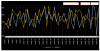
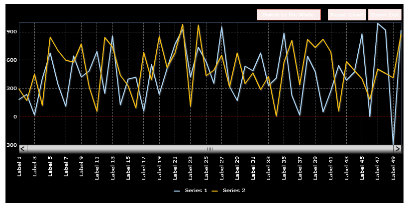
Hi Mark,
Please find our answers below:
1. showVDivLines='1' ---> no vertical div lines
Ans: We tried to render a Zoom Line chart with dummy data using your chart attributes and found that the vertical Div lines show up fine on the chart. This attribute when set to 1 enables the rendering of vertical divisional line for every data label, which seems to be showing up fine. Please refer the attached screenshot.
2. canvasPadding='2' --->canvas padding is enormous
Ans: This attribute is not supported by Zoom Line chart. Please refer the XML API http://docs.fusioncharts.com/charts/contents/index.html?ChartSS/ZoomLine.html for a list of attributes supported by Zoom Line chart.
If you want to reduce the empty space that is present on the left and right side of your chart, then please use the attributes "chartLeftMargin" and "chartRightMargin" of chart element. Please refer the attached XML.
3. toolbar='c0392b' ---> no change of color for the buttons
Ans: The attribute used to change the color of buttons is "toolbarButtonColor". Please refer : http://forum.fusioncharts.com/topic/15732-button-color-for-zoomline/
4. zeroPlaneColor='E51400' ----> did turn red, then disappeared
Ans: This attribute seems to be working fine at our end. Please refer the attached screenshot.
If this does not help, then please attach the entire XML data along with a screenshot of chart obtained.
-
Hi Mark,
If you want to change the color of tool bar buttons, then you need to use the attribute "toolbarButtonColor" and set it to the desired color code.
Ref,
<chart .... toolbarButtonColor='FFFFFF' >
Hope this helps.
-
Hi.
The number of dataplots that can be plotted on a chart, depends on various factors.a. The number of charts rendered per page. If the number is more (even if the data points per chart chart is less) the performance may decrease.b. The chart type. Like: ZoomLine chart is capable of plotting more than 100k data points, without any performance issue. But normal Column2D chart can't.c. The system configuration. Like: RAM capacity, Processor speed and the number of processes running at the time of loading the charts in the browserd. Browser being used.(Eg. It is observed that the browsers like Chrome are faster than IE 8)However, setting off the chart animation, disabling tooltips, removing the applied custom styles might increase the performance for JavaScript charts.Hope this helps. -
Hi,
Please try using the following to make the background of chart transparent:
Ref.
FusionCharts("After").setTransparent(true);
Also, please try using the latest version of FusionCharts v3.3.1 SR3 and check if your problem gets resolved.
Awaiting your response.
-
Please drop a mail to [email protected] along with your order details.
-
Hi,
The performance of charts generally depends on following factors:1. Browser being used2. Number of charts present in a page3. Number of data plots for each chart4. Types of other charts being used in the page (Single series chart, Multi-series chart, Real-time chart, Map etc)5. Machine configurations6. Concurrent scripts or processes runningAjax calls take time since the request first goes to server. However, if you see the Scatter chart taking lots of time, then please let us know the above so that we can help you accordingly.Awaiting your response. -
Hi,
Could you please attach some screenshots of the white gaps that you see so that we can understand your problem better?
Awaiting your response.
-
Hi Kiran,As said above, it is not possible to start the last column of Waterfall chart from the starting point of Y-axis value, as of now.If you want to show some other calculated value in the last column and it should start from Y-axis starting position(Same as first column position), then as a workaround to your requirement, you may use Stacked Column 2D chart from FusionCharts XT pack, instead of Water fall chart. You may set the alpha/transparency of a dataset to 0 so that the stacked columns appear to look like going incrementally higher.Please find an attached XML along with a screenshot of the Stacked Column 2D chart obtained. However, it is not possible to obtain connectors that you have in Water fall chart using this chart type.For information on Stacked Column 2D chart, refer : http://docs.fusioncharts.com/charts/contents/ChartSS/StCol2D.htmlAlso, if you want to use Water fall chart but do not want the last column to be the sum column, then you may set the attribute "showSumAtEnd" to 0.Ref.<chart .. showSumAtEnd='0' >Hope this helps.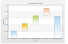
-
Hi,
This does not look feasible, as of now.
Hope this helps.
-
Hi,
It seems that the XML data format that you have used does not confirm to the data format followed by Heat map chart. For the data format used by Heat map chart, refer : http://docs.fusioncharts.com/powercharts/Contents/HeatMap/Overview.html
We have modified your XML data accordingly and attached here for your reference.
<chart showLegend='0'>
    <rows>
        <row id='r1' label=' '/>
    </rows>
    <columns>
        <column id='c1' label=' '/>
        <column id='c2' label=' '/>
    </columns>
    <dataset>
        <set rowId='r1' columnId='c1' value='100' displayValue='test' tooltext='test'/>
        <set rowId='r1' columnId='c2' value='100' displayValue='test' tooltext='test'/>
    </dataset>
    <colorRange mapbypercent='0' gradient='1' minValue='0' code='00CCFF' startLabel='Poor' endLabel='Good'>
        <color code ='66ADD9' maxValue='0' label='BAD'/>
        <color code ='F2CF63' maxValue='70' label='AVERAGE'/>
        <color code ='D99036' maxValue='100' />
    </colorRange>
</chart>
Hope this helps.
-
Hi,
This problem has already been logged as a bug and has been fixed internally.
We shall update this thread when the fix gets released.
-
Hi,
It is not possible to obtain the JSON data in the desired format, as of now.
Hope this helps.
-
Hi,
Do you want to show just one category and one series on the Marimekko chart? If yes, then you may use it in the following way:
Eg."categories": [{"category": [{"label": "Desktop"}]}],"dataset": [{"seriesname": "A","data": [{"value": "335000"}]}]}Hope this helps. -
Hi Tom,It seems that the chart gets loaded before the container after which the chart again re-sizes itself according to the dimensions of the container. It is because of this reason that you see the problem of the chart legend getting distorted.To avoid this problem, please try the following :1. On "onClick" event of each tab, call a function that disposes the chart and creates the chart again.2. After disposing the chart, introduce some delay so that the container gets loaded before the chart.3. Retain the code of chart creation in each of the Divs, so that you may choose to show a chart in the tab when the page is first loaded.Awaiting your feedback.
-
Hi,
Yes, it is possible to specify custom color for each data plot or for each category.
For specifying color for each data plot, you need to use "color" attribute at set level:
Ref.
<set .... color='FF0000' />
For specifying color for each dataset in a Multi-series chart, you need to use "color" attribute at dataset level:
Ref.
<dataset color='00FF00' ... >
For more information, refer : http://docs.fusioncharts.com/charts/contents/index.html?AttDesc/DataPlot.html
Also, if you want to suffix all the numbers visible on the chart with "%", then you may use the attribute "numberSuffix" and set it to "%".
Ref.
<chart ... numberSuffix='%' >
For more information, refer : http://docs.fusioncharts.com/charts/contents/index.html?AttDesc/Number_Basics.html
Hope this helps.
Hope this helps.
-
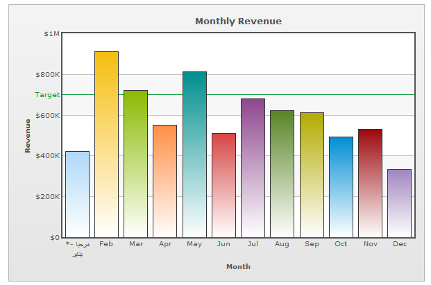
Hi,
We are able to replicate the problem at our end. Please find the attached screenshots of IE and Firefox browsers. We have used the below given code for testing purposes:
Eg,
<set label='مرحبا -* يناير' value='420000' />
We shall analyse more on the problem. Meanwhile, please try setting "labelDisplay" attribute to "Rotate" to avoid this problem.
Ref.
<chart ... labelDisplay='Rotate' ... >
We shall get back to you on this,shortly.

-
Hi,
Welcome to FusionCharts Forum.

Are you seeing this problem on all browsers or is there any specific browser that you see this problem in ?
Also, please share your XML/JSON data that you are using along with the FusionCharts version, so that we can test it at our end.
Awaiting your response.
-
Hi,
We tried to create a sample and deleted a node by clicking on it. We also dragged one node and deleted the other. We found that correct node is getting deleted and also the co-ordinates for the other nodes remains the same. Please find an attached sample that we used for testing.
Could you please modify the sample according to your implementation details and attach it again, so that we can check the problem at our end?
Awaiting your response.


Alert Manager not working
in Using FusionWidgets XT
Posted · Report reply
Hi,
We shall look into it and shall get back to you soon.