
Haritha
-
Content count
489 -
Joined
-
Last visited
Posts posted by Haritha
-
-
Hi,
Yes, the above mentioned workaround works with JavaScript version only.
Another workaround around this, which again works with JavaScript charts only, is to use "LegendItemClicked" event to trap the click event on legend and then change the XML/JSON data of the chart. In this changed data, you may set the "visible" attribute of dataset to 0 for more than one datasets.
For more information on "LegendItemClicked" event, refer : http://docs.fusioncharts.com/charts/contents/index.html?JavaScript/API/Events.html
Hope this helps.
-
Hi,
It is not possible to hide two datasets on click of a legend, as of now.
However, as a workaround, you may have checkboxes above/below your chart and then on click of the checkboxes you may change the XML/JSON data of the chart. In this changed data, you may set the "visible" attribute of dataset to 0 for more than one datasets. By doing this, you will be able to achieve your need.
Ref.
<dataset .. visible = '0' >
For changing the data on client side on click a checkbox, you may use setXMLUrl or setJSONUrl on the DOM ID of the chart. For more information of the same, refer : http://docs.fusioncharts.com/charts/?JavaScript/JS_ChangeData.html
For a demo of using checkboxes and modify the chart, refer : http://www.fusioncharts.com/explore/client-side-data-update
Please note that this workaround works with JS charts only, and not with Flash charts.
Hope this helps.
-
Hi,
If you want the gaps to be shown for the Line also, then you need to specify empty datasets in its corresponding dataset.
Ref.
<dataset parentYAxis="S" seriesName="Run-Rate"><set link="javaScript%3AupdateProductChart%282014%2C1%2C14%29%3B" value="4073"/><set link="javaScript%3AupdateProductChart%282014%2C7%2C1%29%3B" value="4656"/><set/><set/><set/><set/><set/><set link="javaScript%3AupdateProductChart%282014%2C8%2C1%29%3B" value="4552"/><set link="javaScript%3AupdateProductChart%282014%2C9%2C1%29%3B" value="4569"/><set link="javaScript%3AupdateProductChart%282014%2C10%2C1%29%3B" value="4160"/><set link="javaScript%3AupdateProductChart%282014%2C11%2C1%29%3B" value="4147"/><set link="javaScript%3AupdateProductChart%282014%2C12%2C1%29%3B" value="4092"/></dataset>Also, please use the attribute "connectNullData" and set it to 0. This attribute lets you control whether empty data sets in your data will be connected to each other OR will they appear as broken data sets.Ref.<chart ... connectNullData='0' ..>Please find the screenshot of chart obtained after making the above said changes.Hope this helps.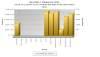
-
-
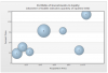
Hi,
The "z" attribute depends on various factors like the width of the chart, chart margins etc. So,the size of the bubble increases proportionately depending on the size of other bubbles.
Hence, if you set the size of all bubbles to the same value then they will have the same size, which is adjusted proportionately depending on the other factors like the width of the chart.
Hope this helps.
-
Hi,
Yes, the values 10M,20M ... have to be plotted on primary y-axis when you set parentYAxis='P' and hence, to accommodate this change the values of primary y-axis are changed.
Hence, the use of attribute "parentYAxis" is vital for Dual y-axis charts.
Hope this helps.
-
Hi Razvan,
Yes, the attribute "parentYAxis" needs to be used and set to "S", if you want your dataset to be mapped to secondary y-axis. Also, the default value of this attribute is "P" (primary y-axis). So, if not specified the dataset gets mapped to primary y-axis by default.
FusionCharts plots the chart based on the data you provide to it. It does not use any mechanism to auto-detect the values and plot the chart accordingly. Also,if you notice, you need to use the attribute "value" of set element even if your values are in value or percentage. For Eg. for one dataset you have values like 200,300 etc and for the other you have 2.5,4.5 etc then if you do not specify that the second one maps to secondary y-axis, you will find that the primary y-axis has accommodated values of both the datasets.
Hope I am able to clarify myself.
-
 Happy FusionCharting!
 -
Hi,
It is possible to have a legend in FusionCharts free too. Ref. http://docs.fusioncharts.com/free/Contents/BasicChartElements.html
However, the free version does not provide various features like legend interactivity.
Also, the range slider cannot be included in the Free version of FusionCharts.
Hope this helps.
-
Hi,
We shall investigate further on this and shall get back to you soon.
-
-
Hi,
Yes, it is possible to change the chart type to allow your user to visualize the same data with a completely different perspective.
You may clone the existing chart telling it to use a different chart type, and render again. For this purpose, you may use the function "clone()".
Ref. var newChart = myChart.clone( { type: 'Pie2D' } );
For information on clone function, you may refer : http://docs.fusioncharts.com/charts/contents/index.html?JavaScript/API/Methods.html
You may see a live demo of the same at : http://www.fusioncharts.com/explore/dynamic-chart-switching
Hope this helps.
-
Hi,
Range Slider as a legend is supported only by PowerCharts XT Heat map chart. Refer the legend of the link : http://www.fusioncharts.com/explore/heatmap_4 . Can you please let us know in which chart type do you intend to use this type of legend with?
It is possible to show a legend similar to the legend present in your "Legends.bmp". Refer our demo gallery link : http://www.fusioncharts.com/explore/interactive-legend
Hope this helps.
-
Hi,
Please find the answers below:
1. Is it Possible to show the Y Axis on the center with the labels as shown in my attachment? Instead of on the left side. I mean I need the Y axis line with labels on the center where you are showing a vertical line(0,0).
Ans: It is not possible to show the y-axis of the chart on the center of the chart, as of now. But as a workaround, you may use two Bubble charts one beside the other (as though they are clubbed) and then show the y-axis of the second chart by not showing it for the first chart. By doing this, you will be able to achieve your requirement.
2. Is it possible to zoom this bubbles ?
Ans: Do you want to have the feature of zooming the bubbles by dragging the mouse cursor across the chart canvas? If yes, this feature is not supported by Bubble chart, as of now.
You may increase the size of the bubble by increasing its diameter, as already said above.
3. Is it possible to show some information on click of each bubble specific to that point?
Ans: The information about the bubble is shown as a tool tip when you hover over the bubble. If you want to show the information by clicking on the bubble, then you may use "link" attribute of set element and call a JavaScript function. In this function, you may use some dialog (eg jQuery Dialog) and show the information as desired.
For information about "link" attribute, you may refer : http://docs.fusioncharts.com/charts/contents/DrillDown/Simple.html
Hope this helps.
-
Hi,
The space between two x-axis labels depends on factors like the left and right margins of the chart, left and right margins of the canvas, number of visible data plots in the visible area of scroll pane, among the others.
Hence, if you want to reduce the space between two x-axis labels, you may choose to show more data plots or increase the space between margins(the start of chart canvas and the start (x) of chart).
Eg.
<chart numVisiblePlot='13' ... >
Hope this helps.
-
Hi,
Do you intend to use Bubble chart because I see the parameter "z" in your set element? If yes, then you need to use Bubble chart from FusionCharts XT pack. For information on bubble chart, refer : http://docs.fusioncharts.com/charts/contents/index.html?ChartSS/Bubble.html
For rendering a bubble chart using your XML, please make the following change:
Ref. var myChart = new FusionCharts("Bubble", "chart1", "550", "400", "1");
Please find the attached screenshot of the chart obtained after making the above said change.
Hope this helps.
-
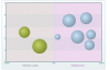
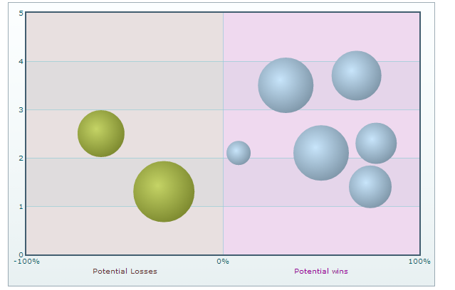
Hi,
If your requirement is to divide the chart to show negative and positive sides and depending on the values of x-axis you want to place the bubbles on either positive or negative side, then this can be achieved using FusionCharts.
It is possible to have categories specifying the number of categories you want the chart to show, and then place have the bubble placed in its respective category depending on its value.
Please find the attached sample XML and a screenshot of chart obtained using the XML. In the chart, the x-axis is divided into two categories - negative (-100 to 0) and positive (0 to 100). If the value of x is negative, the bubble is placed in the negative side and if it is positive it falls on the positive side.
The size of the bubble is determined by the parameter z. You may use the attribute "color" to specify the color of the bubble.
Hope this helps.
-
Hi,
Welcome to FusionCharts Forum
FusionCharts XT Bubble chart is used for plotting data, which is defined in terms of three numeric parameters X,Y and Z. The parameters X and Y represent the co-ordinate positions for placing the bubble. The third parameter Z is used to indicate the diameter of the bubble.
For more information on Bubble chart, refer : http://docs.fusioncharts.com/charts/contents/index.html?AttDesc/BubbleScatter.html
Please check our demo gallery of Bubble charts at http://www.fusioncharts.com/explore/bubble-xy-charts
From your screenshot, it is seen that you have two axes - X axis and Y axis. Could you please confirm if you want to plot the Bubble chart with three numeric parameters? If yes, please let us know what the third parameter represents.
Awaiting your response.
-
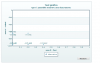
Hi,
Yes, the attribute "plotSpacePercent" is not meant for Scroll Line 2D chart.
It seems that the screenshot that you intended to send across did not get attached.
Could you please attach it again?
-
Hi Giorgio,
Welcome to FusionCharts Forum.
We tried to use the XML with negative values to render the JavaScript variant of Select Scatter chart and found that the chart renders fine at our end. Please refer the attached screenshot.
Also, there is no error seen in the browser console.
However, the chart appears to be having problem in its Flash variant ( no error seen though). We suggest you to to use JavaScript charts instead of Flash charts since JavaScript/HTML 5 charts provide better inter-browser operability. For converting your current Flash chart to JavaScript chart, you may use JavaScript alias name for chart creation instead of SWF file name.
Ref.
var myChart = new FusionCharts("SelectScatter", "SelectChart", "550", "400", "1");
Hope this helps.
-
Hi,
We created a sample and tested it on IE 8. It seems to be working fine on IE 8 too.
Attached the sample for your reference.
Do test it at your end and let us know your feedback.
-
Hi Razvan,
The default z-index applied to tooltip is '999'. So, if you are setting the parent container with higher z-index value, you would need to set the z-index for the element having id "fusioncharts-tooltip-element" accordingly.
Try the following:
#chartContainer1 {position: absolute;z-index: 1000;}#fusioncharts-tooltip-element{z-index: 2000;}Awaiting your feedback.
-
Hi,
A Combination chart with Dual y-axis has two axes called Primary y-axis (left axis) and secondary y-axis (right axis). You may set the minimum and maximum values of both the axes.
For setting the min and max values of primary y-axis use the attributes "PYAxisMinValue" and "PYAxisMaxValue". Similarly, for setting the min and max values of secondary y-axis use the attributes "SYAxisMinValue" and "SYAxisMaxValue".
Eg.
<graph ... PYAxisMinValue='10' PYAxisMaxValue='100' SYAxisMinValue='0.05' SYAxisMaxValue='0.50' >
If you don't specify any of these values, it is automatically calculated by FusionCharts based on the data provided by you.
For more information, refer : http://docs.fusioncharts.com/free/Contents/ChartSS/XML_Col3DLineDY.html
Hope this helps.
-
Hi,
1. Can we have a button on chart like back button which is shown if we drill to some level of chart?. As, now I am disposing parent chart and rendering new chart using javacript function. So, I need a button on which I will render parent chart again and dispose the child chart.
Is this possible to have button on chart?
Ans: No, it is not possible to have a button over a chart.
2. In our application Charts Id and Charts are creating dynamically. So, when I am drilling a chart using js function and disposing parent chart and rendering new chart, I want the same div id in which parent chart is rendering. So can we do this?
Ans: Yes, after disposing the chart, it is possible to create the new chart with the same ID.
3. Can we do same like above function to get the reference of current element?
Ans: Yes, you may refer to the chart container in the similar way but using quotes.
Ref.
$("#chartContainer").updateFusionCharts({ swfUrl: "../../../Charts/Pie3D.swf" });Hope this helps.


Angular Gauge Dial Value
in Using FusionWidgets XT
Posted · Report reply
Hi,
If you want to show a label near the dial instead of the dial value, then you may not show the dial value by setting "showValue" attribute to 0 and then use "text" type of Annotations.
Ref.