
Shu
-
Content count
3 -
Joined
-
Last visited
Posts posted by Shu
-
-
Thanks Haritha,
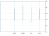
For the 2nd question, Im using sql query to get the data from database. And I also find, it works fine when the chart has been rendered as javascript. However it does not looks well in flash mode. Please see the attachments.
Hi,
Welcome to FusionCharts Forum.

Please find the answers to your queries below:
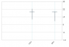
1. I found it is showing Y Axis on right side by default. Is there a way to change it to the left side?
>> It is not possible to show the Y-axis on the left side instead of right side as of now.
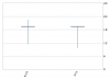
2. I created a chart like below but I found for some reason the X axis are not equally divided. Is it because the first CandleStick starts from the right side? Can we move all the candleStick to left a bit so the candleStick are equally distributed over the chart?
>> Could you please share your XML/JSON data with us for further testing?
Awaiting your response.
-
Hello,
I am working on CandleStick charts and I have two questions about it.
1. I found it is showing Y Axis on right side by default. Is there a way to change it to the left side?
2. I created a chart like below but I found for some reason the X axis are not equally divided. Is it because the first CandleStick starts from the right side? Can we move all the candleStick to left a bit so the candleStick are equally distributed over the chart?
Thanks a lot!


Candlestick Chart Change Yaxis To Left Side
in Using PowerCharts XT
Posted · Report reply
Thanks. Here is what I got from switching to debug mode.
Info: Chart loaded and initialized.
Initial Width: 412
Initial Height: 300
Scale Mode: noScale
Debug Mode: Yes
Application Message Language: EN
Chart Type: Candle Stick Chart
Version: 3.3.0 (XT)
Chart Objects:
BACKGROUND
CANVAS
CAPTION
SUBCAPTION
PYAXISNAME
VYAXISNAME
DIVLINES
YAXISVALUES
HGRID
DATALABELS
DATAVALUES
TRENDLINES
TRENDVALUES
VTRENDLINES
VTRENDVALUES
PRICEPLOT
VOLUMEPLOT
TRENDSETS
ANCHORS
TOOLTIP
VLINES
LEGEND
INFO: Chart registered with external script. DOM Id of chart is VolSpread1363804805574_CandleStick_Chart
INFO: XML Data provided using dataXML method.
XML Data: <?xml version="1.0" encoding="UTF-8"?><chart animation="0" decimalPrecision="0" enableSmartLabels="1" anchorAlpha="0" labelDisplay="Rotate" labelAbbreviateLength="20" plotGradientColor=", ," showvalues="0" slantLabels="1" bgAlpha="0" bgColor="FFFFFF" canvasBorderColor="BABABA" showBorder="0" showAlternateHGridColor="0" divLineColor="BABABA" divLineIsDashed="0" legendPosition="Bottom" legendIconScale="0" showLegend="1" numberScaleValue="1000,1000,1000" numberScaleUnit="K,M,B" decimals="1" outCnvBaseFont="Verdana" outCnvBaseFontSize="9" outCnvBaseFontColor="000000" showToolTipShadow="1" exportEnabled="1" exportShowMenuItem="0" exportAtClient="0" exportHandler="FCExporter" exportAction="save" showExportDialog="0"><dataset seriesName="Low" name="LOW" anchorRadius="3"><set open="19.4" high="17.8" low="11.5" close="19.4" x="1" tooltext="Index name: NDX{br}High: 17.8{br}Low: 11.5{br}Realized: 19.4{br}" /><set open="19.4" high="17.8" low="17.8" close="19.4" x="2" tooltext="Index name: SX5E{br}High: 17.8{br}Low: 17.8{br}Realized: 19.4{br}" /></dataset><categories><category label="NDX" x="1" /><category label="SX5E" x="2" /></categories></chart>