
cristinccc
-
Content count
4 -
Joined
-
Last visited
Posts posted by cristinccc
-
-
Hi Rahul-
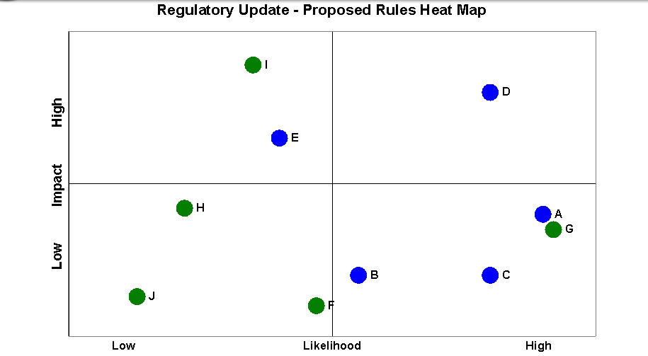
I'm new to Collabion, so am sending the mock-up I did in Excel (which I'm targetting to recreate when we move to Sharepoint as a datasource), just to make sure I have all my bases covered:
Dummy Data: Data in Excel used to create the excel template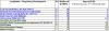
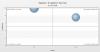
Sample Chart: The heatmap I created in Excel using the data above, which I'm trying to recreate in Collabion/Sharepoint as closely as possible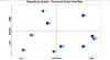
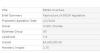
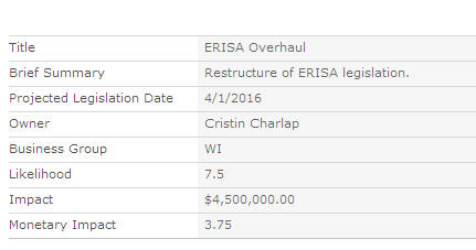
Sample SP List: I put together a mock list with the attached mock entry (there are two total)
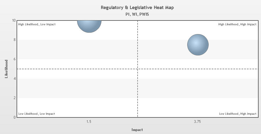
Sample Chart from Sharepoint: I've entered two placeholders by which I'm creating my heatmap- this is what I have so far. To gain perspective, I'm trying to present a visual of where the impact/likelihood aligns on the 0-10 scale.
I hope that all makes sense?
Thanks,
Cristin
-
I'm working on creating a heat map (likelihood vs. impact) using a scatter/bubble chart. While I can set the range of the y-axis to support a 0-10.00 range (10.00 being highest likelihood), I wanted to be able to represent 0-10.00 on the x-axis as well for the visual of highest impact. Hope that makes sense.
-
I have figured out how to set the min/max on the y-axis. How do I do this for the x-axis?
Thank you!

Setting The Scale On X-Axis
in Collabion Charts for SharePoint
Posted · Report reply
Thanks for trying, Rahul! I have gotten pretty close to something that might work. That said, is there a way to denote what a bubble is with a text label? When I try to add a text based data field, it adds a z-axis. I'd just like a way to mouse over and indicate what topic someone is looking at.
Thanks again for your help!
Cristin