
bwoodward730
-
Content count
7 -
Joined
-
Last visited
Posts posted by bwoodward730
-
-
Hello again!!
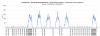
After much time, I have come back to the zoomline chart and see that the issue I had before with the scaling seems to be resolved....great job!!. I have another issue with the way the zoomline chart displays the x-axis. I have attached two images of the chart, one is the zoomed out view and you can see that the x-axis has not displayed correctly. I zoomed into one of the days (second image) and the x-axis seems ok. I have also attached the generated XML file. Can you see if this is replicated with you and if not, where am I going wrong. The data points are in intervals of 15 minutes. Thank you in anticipation.
-
I'm disappointed that you cannot commit on the timeline (20 months between my reply and dsm reply) as this feature is extremely useful when profiling the type of data I'm presenting to my customers (they have all commented on the usefulness of this feature but due to the inaccuracies don't rely on it and would like it removed). Apart from the basic line chart, are there any other charting features you would suggest for profiling large amounts of data.
-
Will this ever be supported as the Zoomline profile is not accurately displayed until you zoom into a particular portion.
-
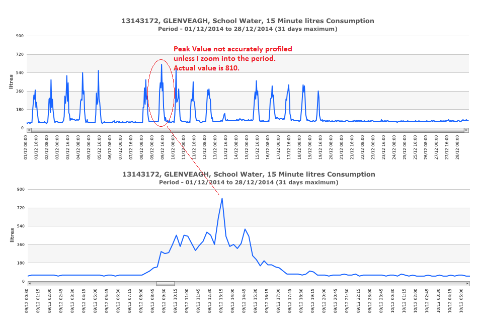
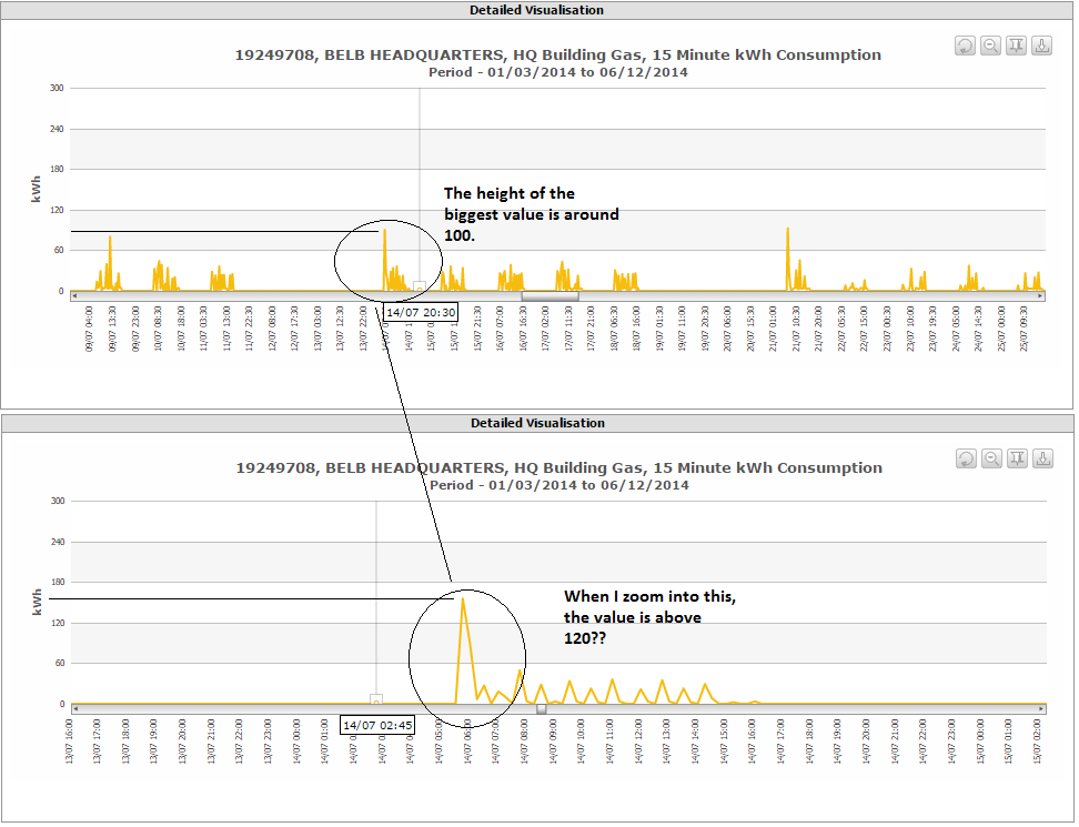
I'm just wondering about the fix for this particular problem. This post is fairly old and I see no resolve, but I'm having the same issue with the Zoomline plot not displaying the peak value unless you zoom into the particular portion of the graph. As dsm mentions in the last reply, 'most people will initially examine a chart zoomed out FIRST in order to determine which areas of interest'. I have customers who have commented on this and I have no answer. Can you please help with this or I will be forced to remove the Zoomline chart and replace with a normal Line chart but with reduced data points. I have a fully licensed copy of Fusioncharts but disappointed that this is still around even with the latest @version 3.5.1.

-
Please help!!
I have attached some compact XML data which I using for Zoomline charts. I have set the 'dynamicaxis' parameter to 1 but the y-axis remains constant when zooming into the dataset. I have tried many different settings but can't get the y-axis to change scale to suit the period zoomed into. Some graphs will just display a line close to zero.
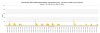
I have attached the data.xml file holding the data and screenshots (All Data Shown and Zoomed in) of a particular site showing that most of the top half of the graph is empty.
What I'm I doing wrong as I would like the axis to rescale to suit, also when viewing the whole period, it gives misleading values, see screenshot 3.
I have upgraded to the latest version of Fusioncharts.......please help.

-
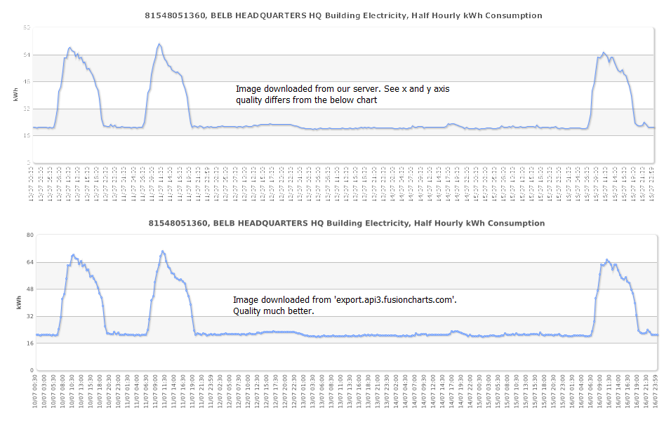
Hi
I have setup our server to export a graph back to the client using Batik. Everything is set up correctly and when the 'export chart' button is clicked and either 'download as jpeg' or 'png' is selected the image is downloaded except the quality between the image downloaded this way and an image downloaded from the 'export.api3.fusioncharts.com' greatly differs as downloaded from our server is a lower quality image. Is there any other setting I need to change to increase the quality of the image from our server.
I have attached the image comparison to the post


Zoomline chart does not display x-axis correctly
in General usage
Posted · Report reply
Thanks for getting back.
1. I removed the attributes as per your post but the initial display of the chart is not what I'm after. I need the chart to display a more higher definition of the data.
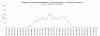
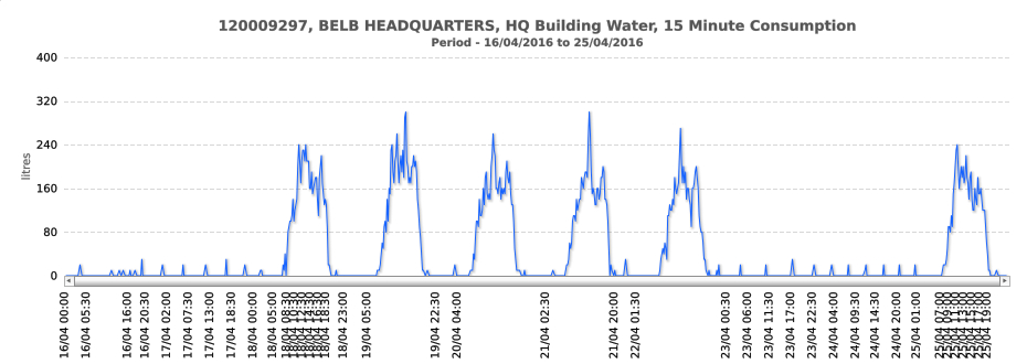
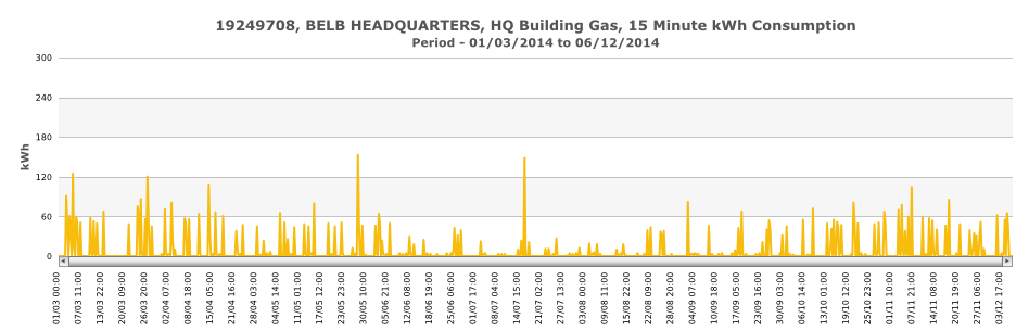
2. I put the attributes back in and changed the maxPeakDataLimit to 1000 and although the x-axis displayed ok, the profile did not display the peak values, See Chart 1.jpg. This had been an original problem from a previous post. I really need the chart to display the correct values when zoomed out as well as zoomed in as the utility supplier will be looking at these and they need to spot peaks from the chart and then zoom into those times.
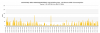
3. If I change the type of utility (from water to gas), again the peak values are not displayed and when I change the maxPeakDataLimit back to 0 or remove it, The peak values return (although when hovered over, they are missed) but the x-axis is displayed incorrectly so I'm back to square one again. See Chart 2.jpg. If I change back to a basic line chart, I get all the points shown (even when hovered over) but loose the functionality of displaying large amounts of data (as it takes too long to render) and being able to zoom in.
Rendering times (xml attached - bigZoomData.xml and bigLineData.xml)
Data from 01/01/2016 to 28/04/2016 (11,328 points)
Line chart - 25 seconds (no zoom functionality). Sorry for being pedantic over the time.
Zoomline chart 3 seconds
I have tried various combination with the attributes you have mentioned but just can't get the final chart to display correctly
I have attached the 2 jpg's and xml files for water and gas.
As I have mentioned before, this is a really good chart with great functionality if it can display correctly.
Any further help is always appreciated
gas.xml
water.xml
bigLineData.xml
bigZoomData.xml