
pc06matt
-
Content count
13 -
Joined
-
Last visited
Posts posted by pc06matt
-
-
Hi,
I am using the "stackedbar2d" chart as in the following jsfiddler
http://jsfiddle.net/x8MDc/437/
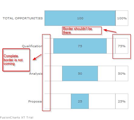
If you notice, in the dataset = "PERCENTAGE", I am using "alpha"=0, and plotbordercolor="#FFFFFF". But still, I can see border around this dataset, before upgrading it used to work.
Another thing, the first dataset, the border is not showing completely, it is breaking from start. Please see details in the image below.
So, My main Issues:
1. Incomplete border in the first Datset
2. Alpha attribute in last dataset.
-
Hi Gagan,
I am also facing the same issue. But only in Firefox and IE, chrome it is working fine. Is it the case?
-
Hello Team,
Could you please provide any updates?? We are using Fusioncharts version 3.5.1.
-
Thanks it helped.
-
Hello Team,
Any update or suggestion? If any workaround is available, that would be good also.
-
Hi,
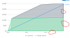
I have the following requirement. I need to create an MSArea chart, which looks like below:

Below is my MSAREA Chart code, enabling "showPlotBorder"
<%
ClipboardPage Pg = tools.findPage("D_SalesPerformanceVsQuota");
int qMaxLength = Pg.getInteger("pxResultCount");
%>
<chart decimals="0" numberprefix="$" plotgradientcolor="" showplotborder="0" bgcolor="FFFFFF" showborder="0" showalternatehgridcolor="0" showvalues="0" showcanvasborder="0" canvasborderalpha="0" legendshadow="0" legendborderalpha="0" labelDisplay="NONE"
showLabels="0" minimiseWrappingInLegend="1" palettecolors="#A9B1BB,#A5EBC5" connectNullData ="1" drawAnchors="1" showPlotBorder="1" plotBorderThickness="2">

<categories>
<%
for(int i=1;i<=qMaxLength;i++) {
  ClipboardPage categoryPg = tools.findPage("D_SalesPerformanceVsQuota.pxResults("+i+")");
  String categoryName= categoryPg.getString("Category");
  String displayName= categoryPg.getString("DisplayText");
  if(displayName != null && !displayName.isEmpty()){
%>
	<category label="<%=displayName%>" showLabel="1" />
<%} else {
%>
	<category label="<%=categoryName%>" />
<%}}%>
</categories>

<dataset seriesname="Commit" plotBorderColor="#5a6572">
<%
for(int i=1;i<=qMaxLength;i++) {
  ClipboardPage seriesPg = tools.findPage("D_SalesPerformanceVsQuota.pxResults("+i+")");
  double dayAmt= seriesPg.getDouble("OppAmount1");
  double cumulativeSum= seriesPg.getDouble("CumulativeSum1");
  String oppName = seriesPg.getString("FirstName");
%>
	<set displayvalue="<%=oppName%>"  <% if(1==i || cumulativeSum!=0){%> value="<%=cumulativeSum%>" <%}%>/>
<%}%>
</dataset>

<dataset seriesname="Closed (Won)" plotBorderColor="#2ed177">
<%
for(int i=1;i<=qMaxLength;i++) {
  ClipboardPage seriesPg = tools.findPage("D_SalesPerformanceVsQuota.pxResults("+i+")");
  double dayAmt= seriesPg.getDouble("OppAmount");
  double cumulativeSum= seriesPg.getDouble("CumulativeSum");
  String oppName = seriesPg.getString("Name");
%>
	<set displayvalue="<%=oppName%>"  <% if(1==i || cumulativeSum!=0){%> value="<%=cumulativeSum%>" <%}%>/>
<%}%>
</dataset>

  <trendlines>
        <line  startValue="0" endValue="390000" color="#2A97DE" valueonright="1" displayvalue="Quota" showOnTop="1" thickness="2"/>
    </trendlines>
</chart>
I am getting chart something like this.
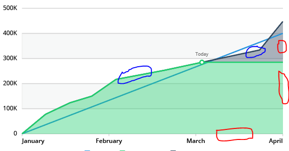
If you notice, in the second screen-shot, I am getting border color in red highlighted area also. We don't want that, we only want the border color to be in upper part of chart.
Please suggest. Thanks!
-
Thanks Soumya!
It is working now. In our case nothing special, actually we are plotting different Quarters as part of series(s), and in different quarter, we want to plot data if data is available for that day. Hence, we were looking for empty data-sets.
Thanks for quick reply.
-
Hi Team,
we have requirement where in a multi-series LINE & AREA chart, for some series we need to plot empty-set data-point(s). Please see below the highlighted series. But looks like its not working.
<chart caption="Sales of Liquor" xaxisname="Close Date" yaxisname="Sales (In USD)" numberprefix="$" palettecolors="#0075c2,#FF6600" bgcolor="#ffffff"  useplotgradientcolor="0" legendborderalpha="0" legendshadow="1" plotfillalpha="60" showxaxisline="1" axislinealpha="25" showvalues="0" captionfontsize="14" subcaptionfontsize="14" subcaptionfontbold="0" divlinecolor="#999999" divlinedashed="1" divlinedashlen="1" divlinegaplen="1" showalternatehgridcolor="0" tooltipcolor="#ffffff" tooltipborderthickness="0" tooltipbgcolor="#000000" tooltipbgalpha="80" tooltipborderradius="2" tooltippadding="5" >


  <categories>
<category label="1" /> <category label="2" /> <category label="3" /> <category label="4" /> <category label="5" /> <category label="6" /> <category label="7" />
    </categories>
<dataset seriesname="Q1 2016">
<set  value="0" /> <set value="10" /> <set value="10" /> <set value="25" /> <set value="25" /> <set value="25" /> <set value="25" />
</dataset>
<dataset seriesname="Q2 2016">
<set  value="0" /> <set value="10" /> <set value="10" /> <set value="35" /> <set value="35" /> <set value="35" /> <set value="35" />
</dataset>

  <dataset seriesname="Quota">
<set  value="2" /> <set /> <set /> <set /> <set /> <set /> <set value="39" />
  </dataset>
  <trendlines>
        <line  startValue="2" endValue="39" color="#0066CC" valueonright="1" displayvalue="Quota Amt" />
    </trendlines>
</chart>
I have found the following related discussion(s), I have posted my query there also. But just for quick reply, I am starting a new thread.
Please let me know if there is some other way to plot empty-sets or Is it a bug??
We are using Fusioncharts version 3.5.1.
-
HI Administrator,
I have verified in my application, we are using Fusioncharts version 3.5.1. But still we are facing this issue. Please advice? -
HI Administrator,
Could you be more specific in version, where this issue is fixed??
http://forum.fusioncharts.com/topic/12675-multiple-series-dynamic-stacked-charts/
-
HI Administrator,
Could you be more specific in version, where this issue is fixed??
-
Hi Team,
I know this is an old discussion. But I have same requirement in Multi-series LINE as well as AREA chart. And I tried this above suggestion, seems like it's not working.
Are we not supporting "<set />" now in latest fusioncharts??
Could you please also let me know if there is not some other way to miss a category in a data-set for multi-series charts, specifically?
Thanks in advance!

"alpha","plotbordercolor" not working in dataset object
in FusionCharts DOM
Posted · Report reply
OK, My 2nd issue is resolved. But with "showXAxisLine"=1, all bars looking connected. We don't want that. We want chart to look like Horizontal funnel.
Is it not a bug from fusion chart?
http://jsfiddle.net/x8MDc/444/