
veeramani.arthanari
-
Content count
15 -
Joined
-
Last visited
Posts posted by veeramani.arthanari
-
-
Hi,
One of our user saw the Below image. Instead of the graph, he saw something like The website uses cookies page.
Please let us know, what went wrong.

Thanks,
Veeramanikandan
-
Thank you Akash for your help
")
-
Hi Akash,
Any update on this solution.?
Thanks,
Veeramanikandan
-
Hi Akash,
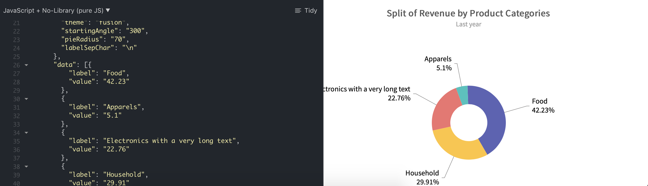
Removing "\n", moving the text away from the graph if the description is too long. In the above fiddle which you've shared, change the data "Electronics" to "Electronics with a very long text". You'll see the attached result.
Thanks,
 Veeramanikandan
-
Hi Akash,
Thanks for you response.
Use these options and you can see the sliced piece is almost overlapping. As it's in browser you can't see it that much, but think of mobile as the device size is very small, it'll overlap like I attached.
"startingAngle": "300",
"pieRadius": "70",
"labelSepChar": "\n"
If you change the settings, you'll see the below result
-
Hi Akash,
Thanks for response. But If all the values are positive, There's a space in graph bottom. I know that's how it'll works, but is there anyway we can balance this both .?
Thank you.

-
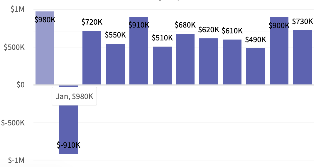
Hello Akash,
Thanks for your response. But what if I've the data both minimum and maximum at extreme like below
{
"label": "Jan",
"value": "980000"
},
{
"label": "Feb",
"value": "-910000"
},One with positive extreme and another with negative extreme. In my issue, I'm having the data 6.9 and -150.8, so it's still overlapping even after increasing the minimumYaxis and maximumYaxis. I'm calculating this dynamically by adding 5 to it, so 6.9 to 11.9 for maximumYaxis and -150.8 to -155.8 for minimumYaxis.
Adding canvasTopPadding or canvasBottomPadding is giving issue in other scenarios where if all the value in there are positive. Please let us know if there's any solution.
Thanks in advance

-
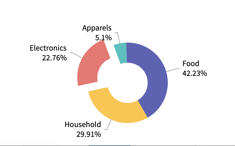
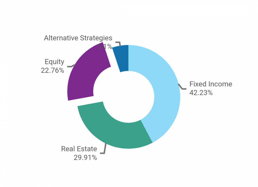
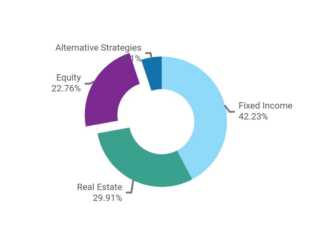
Hi,
Sliced piece of doughnut graph is overlapping other values. You can see expanded Equity slice is overlapping on the Alternative Strategies.
Could you please provide any solution for this.? Attached the image.
Thanks in advance.
-
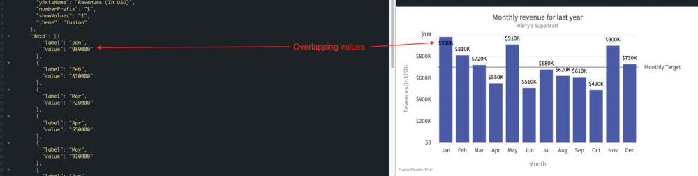
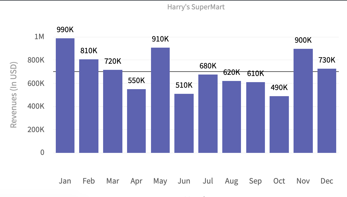
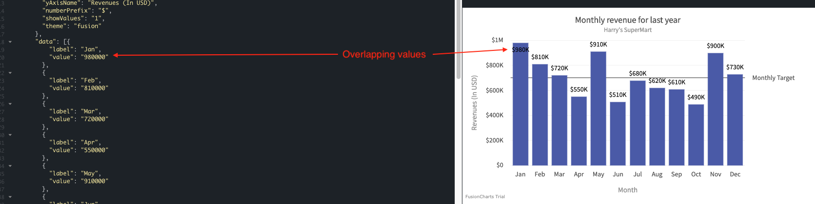
Hi,
I'm getting value overlapping issue in Column2d graph. I've used your example only just to cross-check how it's working.
From this link http://jsfiddle.net/fusioncharts/s7t8F/, I've edited the Jan value from 420000 to 980000, and added the attribute "showValues": "1".
You can see the value $980k is overlapping above the graph column. Is there any option to avoid this issue.?
Thanks in advance.
-
Thank you Akash, this will work :).
Thanks for your help.
-
Hi,
I'm having values/percentages like 15, 35, 40. If I input these values into graph, the Dougnut graph is adjusting its percentage to 100. So the values I input is getting changed.
The above one is just example, in my case it's adding/subtracting the percentage to 0.01 to make sure that graph is having the 100 percentage.
Is there any way, I can make the graph to show 99.99% or 100.01% or restrict it to show only the values/percentages I input.?
Thanks in advance
-
Hi,
We're using stacked area 2d graph in our project. When there is enough data where the graph occupies full height which we've given, circles/anchors which we're using going beyond the screen or it's getting cropped.
Please let us know the solution.
Thanks in advance.

-
I'm using stacked area 2d, I've enabled drawcrossline.
So far I've only two sets of data, so I've two stacked area graph.
When I put plotToolText with Macros, it's showing two graphs of values without any issues.
plotToolText: '$seriesName, $dataValue, $value'
My tooltip will look something like this,
QuoteMyGraphSeriesName1, $34.5k, 345000
MyGraphSeriesName2, $14.5k, 145000
I need to have the sum of the two stacked area graph values in the graph like below.? is it possible to do.?
QuoteMyGraphSeriesName1, $34.5k, 34500
MyGraphSeriesName2, $14.5k, 14500
Total, $49k, 49000
Thanks in advance.
-
I'm trying to log the dataPlotClick event for stacked area 2d chart.
But in iOS, the event is not triggering for any events.
I've not tried yet in Android. But I've to make it work for both Platforms.
Any help will be appreciated.
my Code
this.state = {type: 'column2d',width: '99%',height: '95%',dataFormat: 'json',dataSource: undefined,containerBackgroundColor: '#FFFFFF',calendarReturnsData: undefined,dataEmptyMessage: 'Insufficient data available',baseChartMessageFontSize: '16',baseChartMessageColor: '#454545',detailsBtnStateHolder: true,events: {dataplotclick: (e, a) => {Alert.alert(`You clicked on ${e.data.categoryLabel}`);}}};In render method, I'm destructuring all the variables and assigning it to Fushion Chart.<FusionChartstype={type}width={width}height={height}dataFormat={dataFormat}dataSource={dataSource}containerBackgroundColor={containerBackgroundColor}dataEmptyMessage={dataEmptyMessage}baseChartMessageFontSize={baseChartMessageFontSize}baseChartMessageColor={baseChartMessageColor}events={events}libraryPath={Platform.OS === 'ios'? fusionChartiOSPath: fusionChartAndroidPath}/>
In Graph View, Instead of Graph it shown "The website uses cookies"
in Bug Reports
Posted · Report reply
Hi,
One of our client got very first time when the app launched and graph loaded.
We've purchased the FusionCharts license, so I don't think that trial mark and redirection on FushionCharts website will happen.
Thanks,
Veeramanikandan