
venkatc
-
Content count
61 -
Joined
-
Last visited
Posts posted by venkatc
-
-
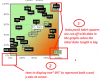
Hi All,
We are using Scatter (X Y Plot) chart. We are displaying data points labels on the chart. We have following issues.
1. Data point labels squares are cut off with data in the charts(Shown in attached screen shot (1)). Is it possible to rotate the particular data point label in the <dataset> tag. Please advice.
2. How to display only one "0%" in the x and y axis at the chart corner(Shown in attached screen shot (2)) of scatter chart. Please advice.
Thanks,
Venkat.
-
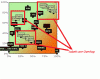
Hi All,
We are using Scatter (X Y Plot) chart. We are displaying data points labels on the chart. When two points are next to each other, the data point labels overlap and often hide the
other point.
Can you advice, how can we solve this issue. Please find the attached screen shot for your reference.
Thanks,
Venkat.
-
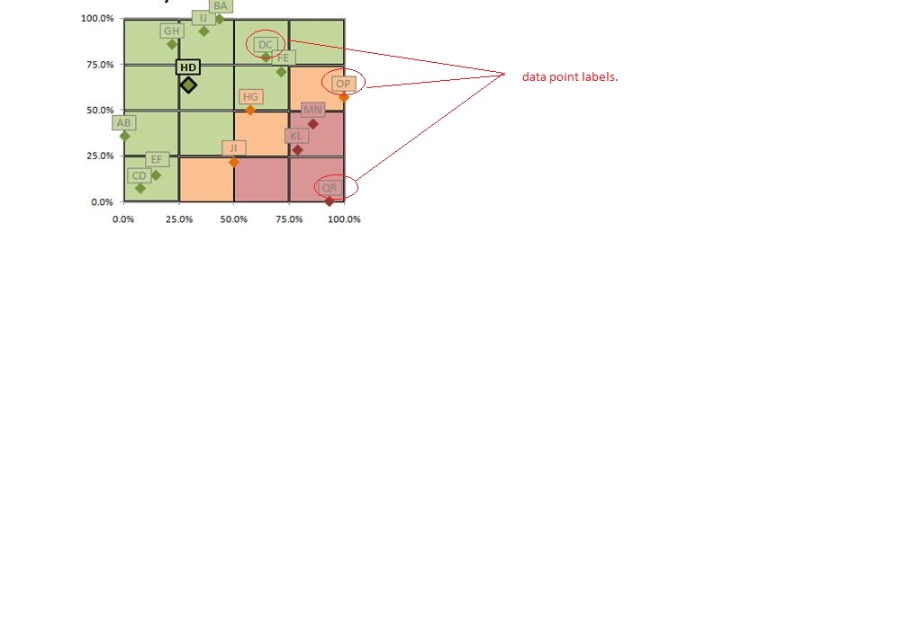
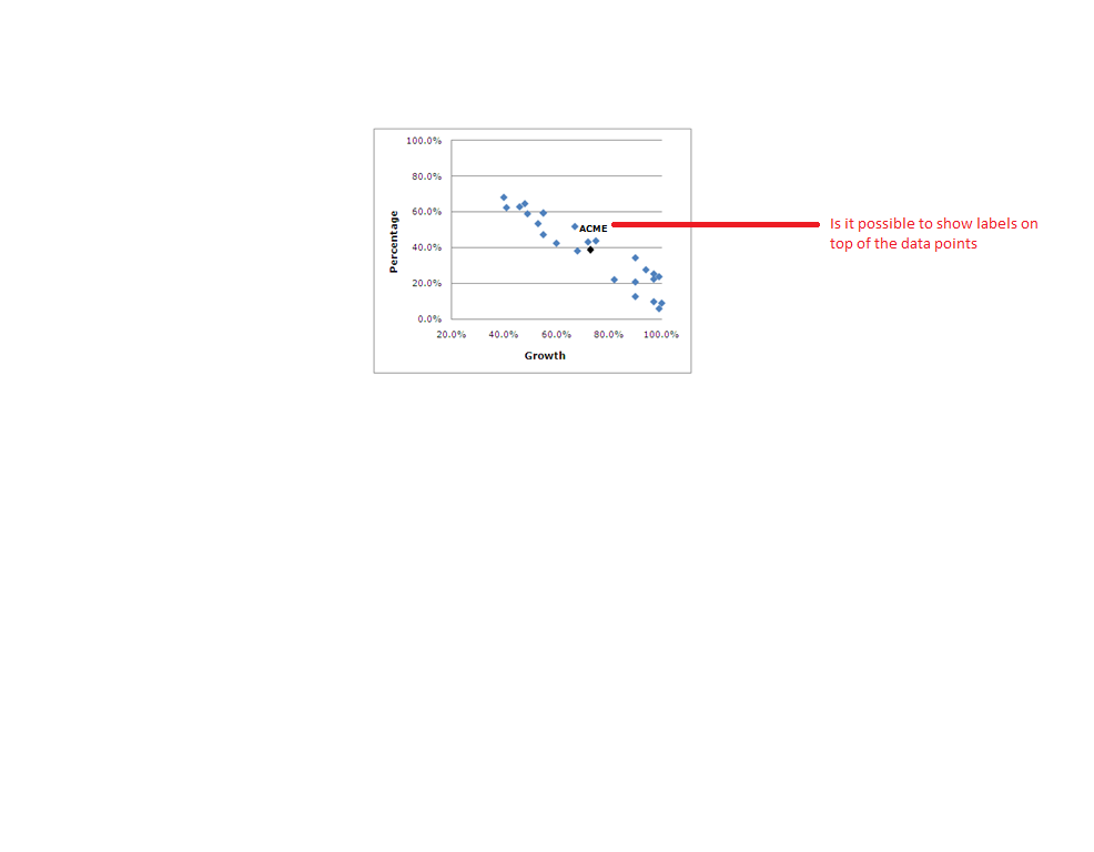
Hi,
Thanks for you support.
We have one more question on data points labels.
Is it possible to format(style) the labels in Scatter (X Y Plot) chart.Please find the attached screen shot.
We need background color and border for data labels.
Please advice.
Thanks,
Venkat.
Hi Venkat,
Yes, it is possible to display the labels on top of the Data points. By setting the showValues attribute to1 in <dataset> element and if you would like to customize the value, use the "displayValue" attribute in the individual <set> element.
It is possible to obtain a color zone either vertically or horizontally using TrendLines/ Vertical Trend Line. I'm afraid, FusionCharts doesn't support various color for the same zone.
For more information about Scatter Plot, please refer the following link:
http://www.fusioncharts.com/docs/ChartSS/Scatter.html
I hope this helps.
-
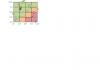
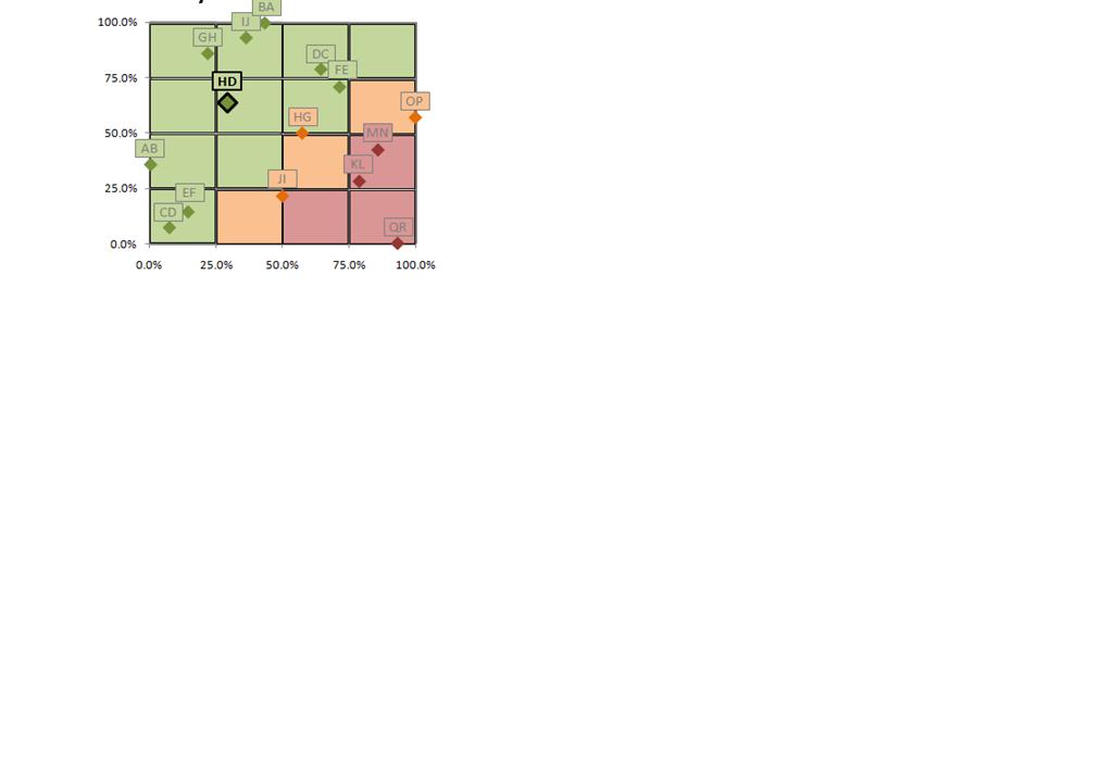
Hi,
I am using Scatter (X Y Plot) chart.
Is it possible to display labels on top of the Data Points. Please see the attached image for more details.
Is it possible to add the colors for cells like in the attachment.
Regards
Venkat
-
I am using "DragNode.swf" and FusionChart.js to render this chart.
In FusionChart.js this is the version information I found
/**
* FusionCharts: Flash Player detection and Chart embedding.
* Version: 1.2.4 (16th February, 2009) - Added fix for chart with % width/height.
* Version: 1.2.3 (15th September, 2008) - Added fix for % and & characters. Additional fixes to properly handle double quotes and single quotes in setDataXML() function.
* Version: 1.2.2 (10th July, 2008) - Added fix for % scaled dimensions, fixes in setDataXML() and setDataURL() functions
* Version: 1.2.1 (21st December, 2007) - Added setting up transparent/opaque mode: setTransparent() function
* Version: 1.2 (1st November, 2007) - Added FORM fixes for IE
* Version: 1.1 (29th June, 2007) - Added Player detection, New conditional fixes for IE
*
* Morphed from SWFObject (http://blog.deconcept.com/swfobject/) under MIT License:
* http://www.opensource.org/licenses/mit-license.php
*
*/
-
The screenshot is attached.
-
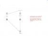
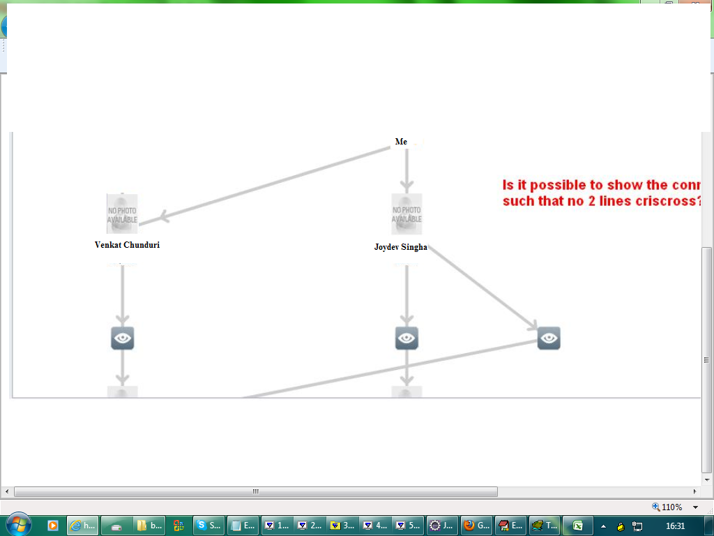
I am using fusion charts to show relationship between me and my colleagues. But something the lines which are connecting the user are overlapping. Is there any way to guarantee that the lines will never overlap. Please advice.
I am attaching the screen shot for your reference.
Please suggest
Thanks
Venkat

-
Hi,
I am using select scatter charts in my application. I am trying to display 4000 data points in two charts. The IE browser is freezing when scatter chart is loading all the data points.
How can i slove this. Please advice.
Please find the attached screen shot.
Thanks,
Venkat.
-
I did not get any response to this from yesterday can you please give me your suggestion.
Display of the amount is very important. Please help.
-
Please reply to this.
-
Can you please reply to this.
-
Hi,
I am using selectscatter chart in my application. On the X-axis I am showing 6 values. The values can be larger.
Some times the values are not shown.
Can you please suggest how can I display the entire text.
Please see the attachment for more details
-
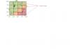
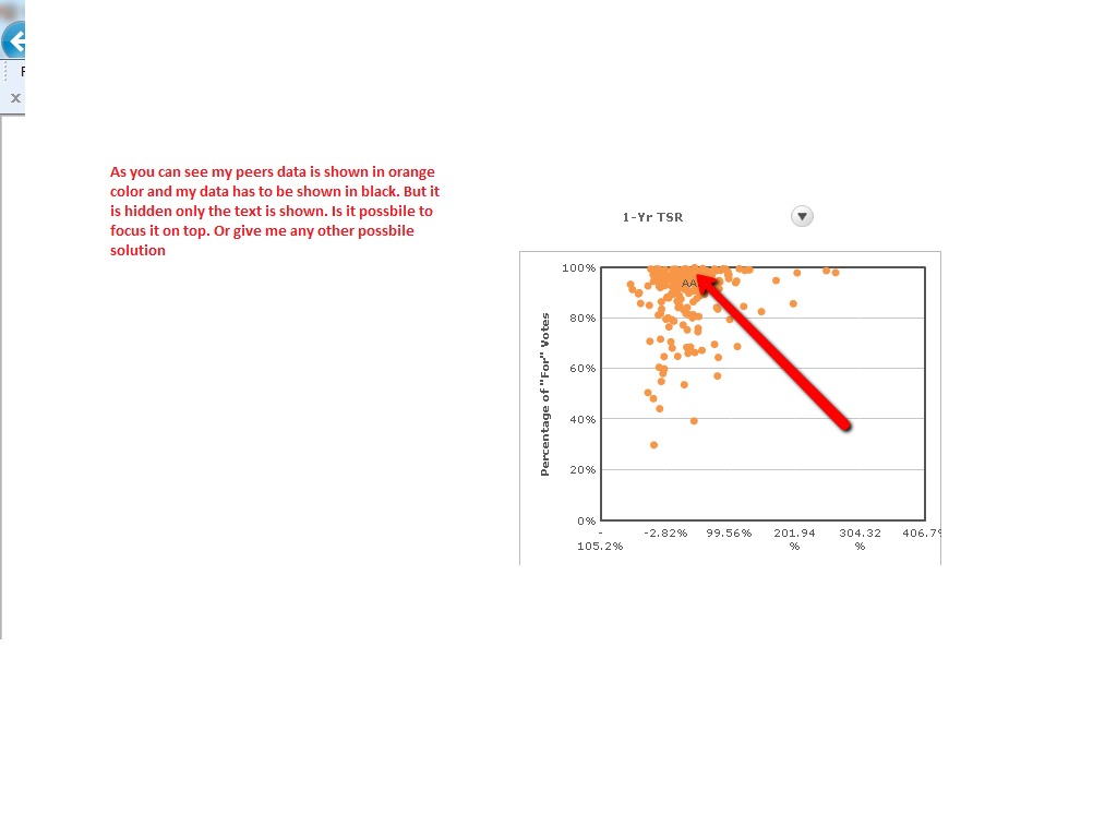
Hi,
I am using selectedscatter charts in my application.
I am categorising datapoints in two different dataset. In one dataset I want to show my data (Black Color) and another dataset I am showing my peers data (Orange color). But in some cases if the x-axis and y-axis values are same for my data and peers data then they are merged. The black color data point is not visible.
It is possible to focus it on top of others or any other solution such that I should always show my data.
Please find the attachment for more details.
How can I achieve this.
Thanks
Venkat

-
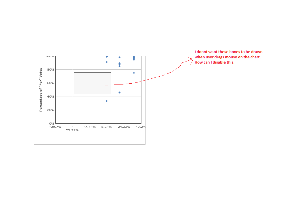
Hi,
I am using selectscatter charts in my application. I want to disable drawing boxes on the charts when user drags the mouse on the chart.
How can I disable this functionality. Please find the attachment for more information.
Please suggest.
-
Thanks for your reply.
I have used the below code in the xml. But I am not able to see the text on the graph.
<dataSet id="DS2" seriesName="" Color="000000" plotBorderThickness="0" showPlotBorder="1" anchorSides="3">
<set id="S1" displayValue="Acme" x="28" y="35"/>
</dataSet>
-
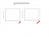
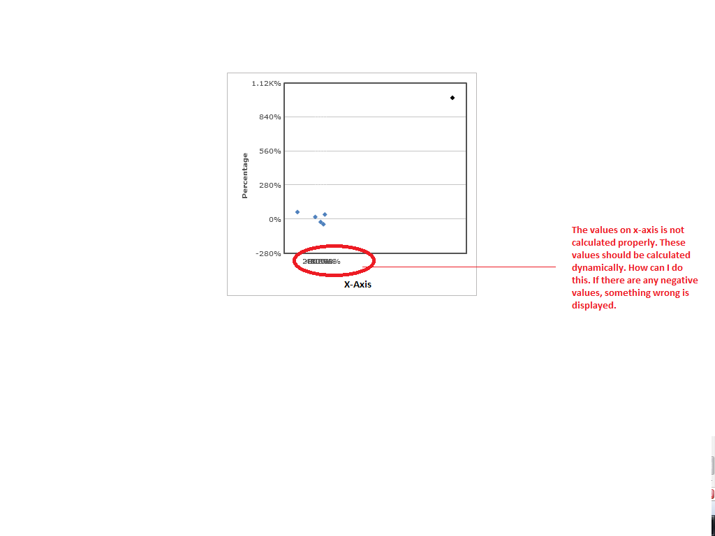
Hi,
I am using selectscatter chart in my application. I am facing issue in displaying the values on x-axis.
The x-axis and y-axis values are not static, it will change based on the requirement. So I cannot fix up the min value and max values on both x-axis and y-axis.
Based on the xml input selectscatter is able to calculate and display the correct values on y-aixs. Suppose if the minimum value is 10 and maximum value is 100.
I am able to see values as 10, 20, 30 .. 100 on y-axis. But the same thing is not happening with x-axis. How the data values can be determined dynamically on x-axis.
Please suggest.
It is also possible to get negative values on x-axis. Please see the attached image, the values are not calculated and displayed properly.
Regards,
Venkat
-
Hi,
I am using selectscatter chart. Is it possible to display labels on top of the Data Points. Please see the attached image for more details.
Regards
Venkat

-
Hi,
Thanks for your response,
Basically i want to increase the width of the legend(total Box) not the legend icon .
Can you please update me how can i solve this issue.
Thanks.
Hi,
Thanks for your post.
Please try the same by using <legendIconScale> attribute inside the <chart> element.
For more details, please visit the link: http://www.fusioncharts.com/docs/?ChartSS/Combi2D.html#Anchor16
Hope this helps.

-
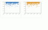
Hi
I am using MSCombi2D.swf and I got some issue with legends text wrapping into the next line.
Can you please suggest me how can I increase the legend size with out increasing the chart size.
Please find the attached fusion chart for more details.
Thanks
-
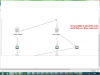
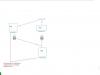
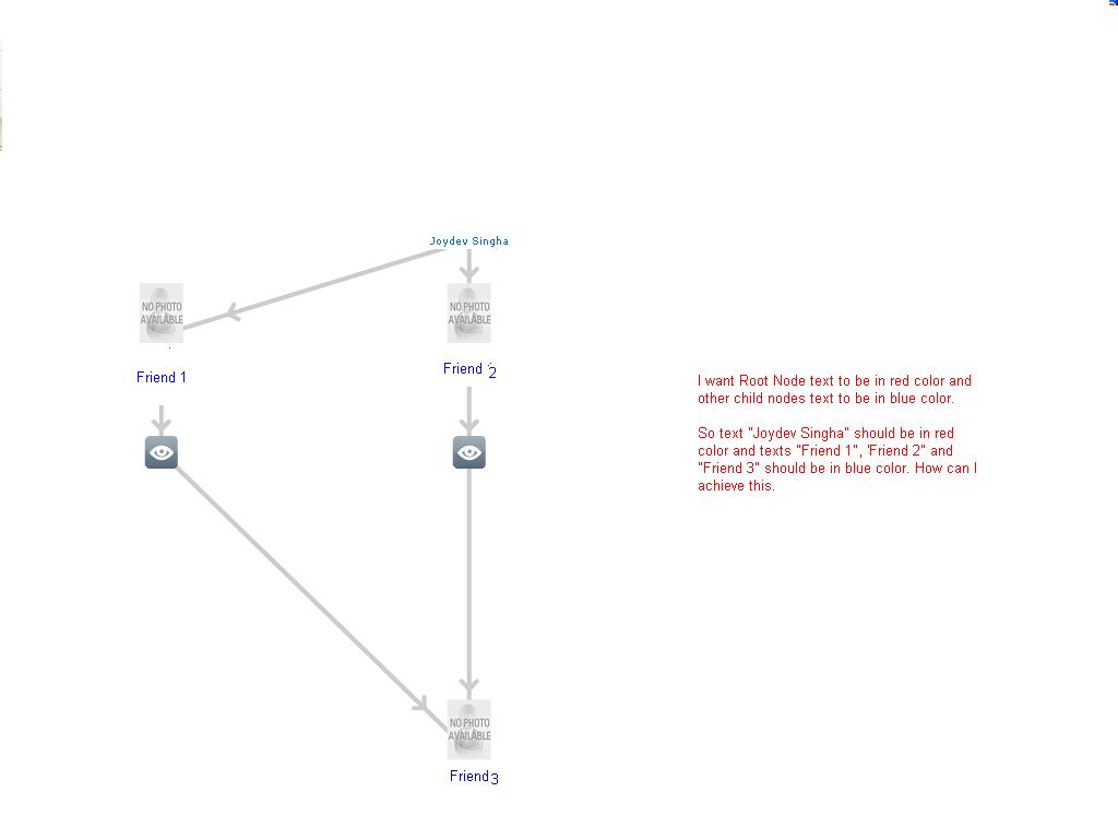
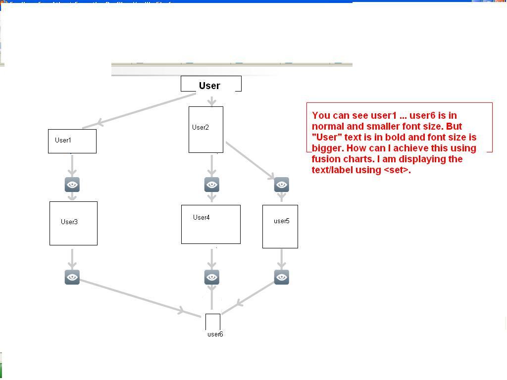
Hi,
I am using "DragNode.swf" to show relationship between users in application. Through one of my posts in the forum I came to know Fusion Charts at present does not support different font size of data labels. At least is it possible for me to use different font color for the root node from child nodes.
My earlier post url
http://forum.fusioncharts.com/topic/8973-different-font-size-for-data-labels/
I am attaching a screen shot for my requirement. Please suggest.
Waiting for early reply.
Thanks
Venkat
-
Please find the file attached. This is how I am rendering the chart.
Waiting for early reply.
-
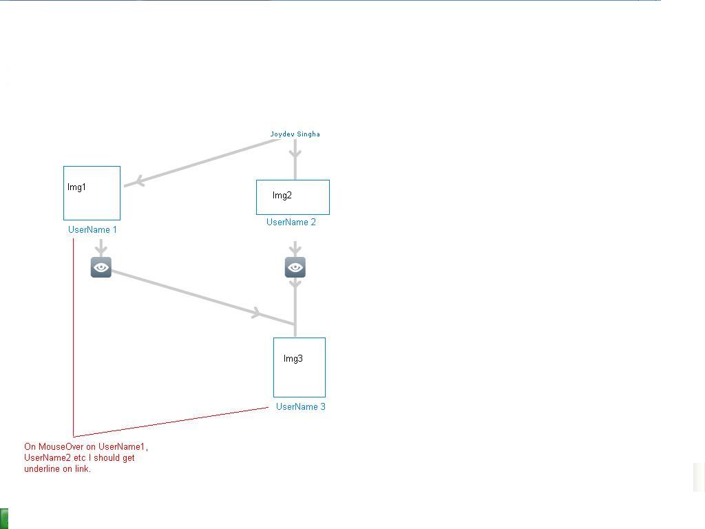
Hi
I am using power chart to show relationship between different users. Just below an image I am showing up the user name. The image or user name is linked to some other page. This is working fine, I used the below set tag attributes
<set x="470" y="70" toolText="user name1" width="40" height="95" alpha="0" labelAlign="bottom" color="FFFFFF" label="user name1" link="user.html" id="10" imageurl="username1.jpg" imageNode="1" imageAlign="top" imageHeight="55" imageWidth="40" />
What I actually want is to show underline on username link when mouse hover. Please let me know how can I do that.
Thanks
Venkat
-
Can you please reply back.
-
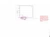
Please find the attachment. I have given the description in the screen shot. Please suggest.
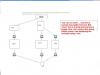


New Chart
in General usage
Posted · Report reply
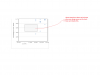
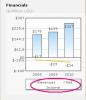
Hi All,
We are trying to implement the 2D Column Chart in our project. But we need horizontal dashed line in 2D Column chart based on the x and y value.
Please find the attached screen shot for you reference.
Please suggest how can create the chart shown in screen shot.
thanks,
Venkat.