
Harikrishnan Sivarajan
-
Content count
36 -
Joined
-
Last visited
-
Days Won
2
Posts posted by Harikrishnan Sivarajan
-
-
Hi,
When we use our local machine its working fine......But after when we move on the production (live) machine its not workin g
See the attached image
same code used 2 sides
Any issue ?
-
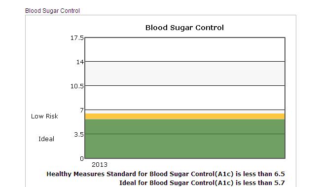
Hi we are using the chart with these parameters
<script type="text/javascript">
var chart_divChartBSC = new FusionCharts({"debugMode" : "0", "swfUrl" : "https://secure.myaisleone.com/Aisleone2_uat2/Benefit/Line.swf", "renderAt" : "divChartBSCDiv", "width" : "550", "wMode" : "opaque", "dataFormat" : "xml", "id" : "divChartBSC", "registerWithJS" : "1", "height" : "350","dataSource" : "<chart showLegend='1' yAxisNamePadding='-97' chartLeftMargin='10' yAxisValuesPadding='0' numDivLines='4' divLineColor='000000' divLineAlpha='100' outCnvBaseFontColor='000000' basefontsize='11.5' showYaxisValues='1' canvasPadding='30' legendPadding='100' yAxisMaxValue='17.5' yAxisMinValue='0' bgColor='ffffff' canvasBgColor='ffffff' caption='Blood Sugar Control' paletteColors='' lineColor='FF0000' showToolTipShadow='1' toolTipBorderColor='red' LineThickness='1' anchorSides='4'anchorBgColor='FF0000' anchorRadius='2' yAxisName='' formatNumberScale='0' xAxisName=' '><set label='2013' value='2' /><set label='' value='' /><trendlines> <line startValue='0' endValue='5.69' isTrendZone='1' displayValue=' ' color='40812e' alpha='75' valueOnRight='1' dashed='1' showOnTop='0'/></trendlines><trendlines> <line startValue='0' endValue='5.69' isTrendZone='1' displayValue='Ideal ' color='000000' alpha='0' showOnTop='0'/></trendlines><trendlines> <line startValue='5.7' endValue='6.5' isTrendZone='1' displayValue=' ' color='FFB900' alpha='75' valueOnRight='1' dashed='1' showOnTop='0'/></trendlines><trendlines> <line startValue='5.7' endValue='6.5' isTrendZone='1' displayValue='Low Risk ' color='000000' alpha='0' showOnTop='0'/></trendlines><trendlines> <line startValue='6.5' endValue='20' isTrendZone='1' displayValue=' ' color='ffffff' alpha='75' valueOnRight='1' dashed='1' showOnTop='0'/></trendlines><trendlines> <line startValue='6.5' endValue='20' isTrendZone='1' displayValue='Hgh Risk ' color='000000' alpha='0' showOnTop='0'/></trendlines><styles><definition><style name='myCaptionFont' bgColor='ffff00' type='font' font='verdana' size='10' isHTML='0' color='666666' bold='0'/><style name='myShadow' type='Shadow' color='999999' angle='45' bgColor='FFFFDD'/><style name='myGlow' size='40' bold='1' type='Glow' color='FF5904' underline='1' bgColor='FFFFDD'/></definition><application><apply toObject='' styles='myCaptionFont,myShadow' /><apply toObject='XAxisName' styles='myShadow' /><apply toObject='YAxisName' styles='myCaptionFont' /></application><definition><style name='MyFirstFontStyle' type='font' color='000000' isHTML='1'/></definition><application><apply toObject='TRENDVALUES' styles='MyFirstFontStyle' /></application></styles></chart>"}).render();</script>
but here the y-aoxs value is not rendering perfectly
Plese do the needfull.Its very urgent
Waitng for the reply
See the attached image
-
Hi,
Thanks for the reply.That answer is helped me lot.\Thanks once more
Hari
Cochin
India
Hi Hari,
To do so, you just need to set <chart ... connectNullData='1' ..>
For more information on 'Plotting Discontinuous Data', please refer the following link:
-
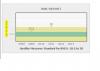
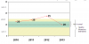
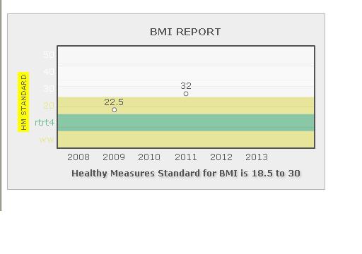
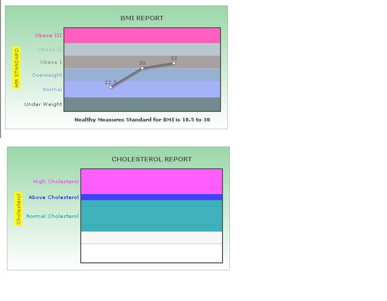
I have created a chart using this xml
<chart basefontsize='11.5' showYaxisValues='0' canvasPadding='30' legendPadding='100' yAxisMaxValue='60' yAxisMinValue='0'
bgColor='dddddd' canvasBgColor='dddddd' caption='BMI REPORT' paletteColors='' showToolTipShadow='1' toolTipBorderColor='red'
yAxisName='HM STANDARD' formatNumberScale='0' xAxisName='Healthy Measures Standard for BMI is 18.5 to 30'>
<set label='2008' value='' />
<set label='2009' value='22.5' />
<set label='2010' value='' />
<set label='2011' value='32' />
<set label='2012' value='' />
<set label='' value='' />
<trendlines>
<line startValue='0' endValue='10' isTrendZone='1' displayValue='ww' color='eae786' alpha='75' />
</trendlines>
<trendlines>
<line startValue='10' endValue='20' isTrendZone='1' displayValue='rtrt4' color='6abc90' alpha='75' />
</trendlines>
<trendlines>
<line startValue='20' endValue='30' isTrendZone='1' displayValue='' color='eae786' alpha='75' />
</trendlines>
<trendlines>
<line startValue='30' endValue='40' isTrendZone='1' displayValue='' color='ffffff' alpha='75' />
</trendlines>
<trendlines>
<line startValue='40' endValue='50' isTrendZone='1' displayValue='' color='ffffff' alpha='75' />
</trendlines>
<trendlines>
<line startValue='50' endValue='60' isTrendZone='1' displayValue='' color='ffffff' alpha='75' />
</trendlines>
<styles>
<definition>
<style name='myCaptionFont' bgColor='ffff00' type='font' font='verdana' size='10' isHTML='0' color='666666' bold='0'/>
<style name='myShadow' type='Shadow' color='999999' angle='45' bgColor='FFFFDD'/>
<style name='myGlow' size='40' bold='1' type='Glow' color='FF5904' underline='1' bgColor='FFFFDD'/>
</definition>
<application>
<apply toObject='' styles='myCaptionFont,myShadow' />
<apply toObject='XAxisName' styles='myShadow' />
<apply toObject='YAxisName' styles='myCaptionFont' />
</application>
</styles>
</chart>
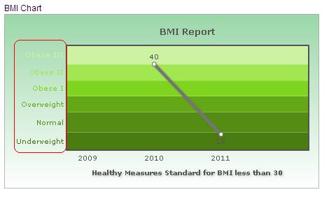
on this basis drawing the chrt like this(Please see the attached image)
In the image, we can see the chart is not drawing the line because the y-axis value of 2010 is missing
In our application the data will be miss.So any possible to draw the line without one value.
Waiting for the reply
-
I am afraid, FusionCharts does not support different colors for trendline and trendline labels, as of now.
I have found a successful work around to achieve this:
<definition>
<style name='MyFirstFontStyle' type='font' color='000000' isHTML='1'/>
</definition>
<application>
<apply toObject='TRENDVALUES' styles='MyFirstFontStyle' />
</application>
-
You would need to use <valueOnRight='1'> attribute inside the <<trendlines> element in order to show the text on right side.
For ex:
<trendlines>
     <line startValue='26000'  displayValue='{Target}'  valueOnRight='1' >
  </trendlines>
Hope this helps.
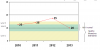
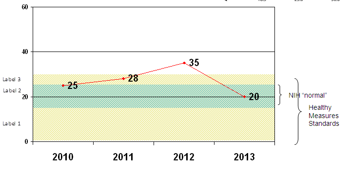
Is it possible to club 3 trendlines as shown in the image and give a single lable on the right. I need the original lables to be present on the left side as well.
-
Hi,
Could you please send us a screenshot or any live link of your requirement?
Awaiting for your response.
-
Hi Hari,
Welcome to FusionCharts forum.
I'm afraid, FusionCharts for free doesn't support "Slashed trendlines" property.

I hope this helps.
What about the below ones :
1. having a different color for the LABEL of trendlines. (i.e the trendline will have blue or green and I need to have a black color label for the same)other than the trendline color
2. putting braces and text on right side as shown in the original image
-
Is it possible to achieve a graph as shown in the attached image using FusionCharts free?
-
Hi,
Can we change/set the y-axis font color?
please see the attached image.
Thanks and reagrds
HAri
-
Hello
Its working fine
thanks
 :)
:)Hi,
Thanks for your post.
Please try the same by setting <animation='0'> attribute inside the <chart> element.
This attribute gives you the option to control animation in your charts. If you do not want to animate any part of the chart, set this as 0.
Hope this helps.

-
Hello
Can we avoid the animation while creating the line,?
Any idea?
please do reply
Thanks hari
-
Yes we need this.
is this free?
Hi,
Thanks for your response.
I think the multi-axis line chart from PowerCharts suite will suffice your requirement.
For more details, please visit the links below:
http://www.fusioncha...s/Overview.html
http://www.fusioncha...ne/MALine1.html
http://www.fusioncha...ne/MALine2.html
Hope this helps.
-
Hello
Thanks for the reply...
1 more quote.
Can we add multiple y-axis in the line chart(right and left)..IS this possible?
left for systolic and right for diastolic..
is this possible?
please reply
Thanks hari
Hi,
Thanks for your response.
I am afraid, there is no chart availability for this requirement, at this time.

We will try to implement this in our future upgrades.
Meanwhile, keep FusionCharting!

-
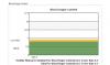
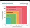
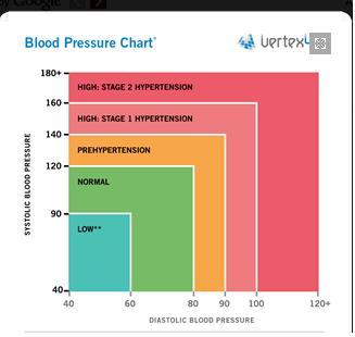
Hello
This is our requirement for creating the chart for Blood pressure
Please see the attached image
Here Normal getting based on two values.Systolic and diastolic.
Is there any chart availablity for this requirement.in fusion chart ?....not same as the image which i have attched earlier...
Please do reply..
regards
Harikrishnan.S
Hi Hari,
Thanks for your post.
I am afraid, this is not possible with FusionCharts, at this time.
Thank you very much for your continued patience and patronage.
Hope you have a great day!

-
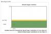
Hi,
Can we create a chart like this . I have attached a image
This is a chart for Blood Pressure.
Please do reply
Thanks and regards
HAri
-
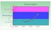
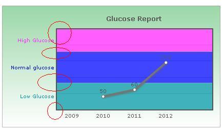
Hi
Thanks for the reply
I need to display all values(startvalue,endvalue and display value)
<line startValue='30' endValue='70' isTrendZone='1' displayValue='Low Glucose' color='0099a5' alpha='75'/>
is that possible ?
pls reply
my xm l file added
<chart showYaxisValues='0' canvasPadding='30' legendPadding='100' yAxisMaxValue='150' yAxisMinValue='30' bgColor='ffffff,36AF50,dd5904' canvasBgColor='ffffff' caption='Glucose Report' paletteColors='' showToolTipShadow='1' toolTipBorderColor='red' yAxisName='' formatNumberScale='0' xAxisName=''>
<set label='2009' value='' />
<set label='2010' value='50' />
<set label='2011' value='60' />
<set label='2012' value='100' />
<set label='' value='' />
<trendlines>
<line startValue='30' endValue='70' isTrendZone='1' displayValue='Low Glucose' color='0099a5' alpha='75'/>
</trendlines>
<trendlines>
<line startValue='70' endValue='116' isTrendZone='1' displayValue='Normal glucose' color='7fft7t' alpha='75'/>
</trendlines>
<trendlines>
<line startValue='116' endValue='150' isTrendZone='1' displayValue='High Glucose' color='ff2aff' alpha='75'/>
</trendlines>
<styles>
<definition>
<style name='myCaptionFont' bgColor='ffff00' type='font' font='verdana' size='10' isHTML='0' color='666666' bold='0'/>
<style name='myShadow' type='Shadow' color='999999' angle='45' bgColor='FFFFDD'/>
<style name='myGlow' size='40' bold='1' type='Glow' color='FF5904' underline='1' bgColor='FFFFDD'/>
</definition>
<application>
<apply toObject='' styles='myCaptionFont,myShadow' />
<apply toObject='XAxisName' styles='myShadow' />
<apply toObject='YAxisName' styles='myCaptionFont' />
</application>
</styles>
</chart>
Hi,
Please try the same by setting <displayValue> attribute inside the <trendlines> elements.
If you want to display a string caption for the trend line by its side, you can use this attribute. Example: displayValue='Last Month High'. When you don't supply this attribute, it automatically takes the value of startValue.
Hope this helps.
-
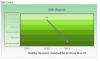
Heloo
I have to show the startvalues/endvalue in trendline
See the attched image
is that possible
-
Hi,
That's working fine.
Thanks
hari
Hi,
Thanks for your post.
Please try the same by setting <showYAxisValues='0'> attribute inside the <chart> element.
Hope this helps.
-
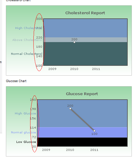
Hi,
How can we hide tha y axis values. see the attached image.
Please do reply
Thanks and regards
HAri
MY xml added
<chart canvasPadding='30' legendPadding='100' yAxisMaxValue='300' yAxisMinValue='100' bgColor='ffffff,36AF50,dd5904' canvasBgColor='ffffff' caption='Cholesterol Report' paletteColors='' showToolTipShadow='1' toolTipBorderColor='red' yAxisName='' formatNumberScale='0' xAxisName=''>
<set label='2009' value='' />
<set label='2010' value='200' />
<set label='2011' value='' />
<set label='' value='' />
<trendlines>
<line startValue='100' endValue='200' isTrendZone='1' displayValue='Normal Cholesterol' color='426569' alpha='100'/>
</trendlines>
<trendlines>
<line startValue='200' endValue='220' isTrendZone='1' displayValue='Above Cholesterol' color='a2b4be' alpha='100'/>
</trendlines>
<trendlines>
<line startValue='220' endValue='300' isTrendZone='1' displayValue='High Cholesterol' color='7597c4' alpha='100'/>
</trendlines>
<styles>
<definition>
<style name='myCaptionFont' bgColor='ffff00' type='font' font='verdana' size='10' isHTML='0' color='666666' bold='1'/>
<style name='myShadow' type='Shadow' color='999999' angle='45' bgColor='FFFFDD'/>
<style name='myGlow' size='40' bold='1' type='Glow' color='FF5904' underline='1' bgColor='FFFFDD'/>
</definition>
<application>
<apply toObject='' styles='myCaptionFont,myShadow' />
<apply toObject='XAxisName' styles='myShadow' />
<apply toObject='YAxisName' styles='myCaptionFont' />
</application>
</styles>
</chart>

-
Hello
we cannot add the values in the chart,(showYAxisValues='0' showLabels='0'
) cos we adding the data programetically. So yaxisvalues hiding all the charts.This is not accepable
see the attach file
pls reply
any hope
HI,
We have tested the code from our end and it is working fine.
Please find the attached screenshot for your reference.

-
Vesion : 3.2.1
Info: Chart loaded and initialized.
Initial Width: 450
Initial Height: 250
Scale Mode: noScale
Debug Mode: Yes
Application Message Language: EN
Version: 3.2.1
Chart Type: Single Series 2D Line Chart
Chart Objects:
BACKGROUND
CANVAS
CAPTION
SUBCAPTION
YAXISNAME
XAXISNAME
DIVLINES
VDIVLINES
YAXISVALUES
HGRID
VGRID
DATALABELS
DATAVALUES
TRENDLINES
TRENDVALUES
DATAPLOT
ANCHORS
TOOLTIP
VLINES
VLINELABELS
INFO: Chart registered with external script. DOM Id of chart is divChartCOL
INFO: XML Data provided using dataXML method.
XML Data: <chart showYAxisValues="0" showLabels="1" canvasPadding="30" legendPadding="100" yAxisMaxValue="300" yAxisMinValue="100" bgColor="ffffff,36AF50,dd5904" canvasBgColor="ffffff" caption="CHOLESTEROL REPORT" paletteColors="" showToolTipShadow="1" toolTipBorderColor="red" yAxisName="Cholesterol" formatNumberScale="0" xAxisName=""><set label="2009" value="" /><set label="2010" value=" " /><set label="2011" value=" " /><set label="2012" value=" " /><set label="" value="" /><trendlines> <line startValue="100" endValue="200" isTrendZone="1" displayValue="Normal Cholesterol" color="0099a5" alpha="75" /></trendlines><trendlines> <line startValue="200" endValue="220" isTrendZone="1" displayValue="Above Cholesterol" color="7fft7t" alpha="75" /></trendlines><trendlines> <line startValue="220" endValue="300" isTrendZone="1" displayValue="High Cholesterol" color="ff2aff" alpha="75" /></trendlines><styles><definition><style name="myCaptionFont" bgColor="ffff00" type="font" font="verdana" size="10" isHTML="0" color="666666" bold="0" /><style name="myShadow" type="Shadow" color="999999" angle="45" bgColor="FFFFDD" /><style name="myGlow" size="40" bold="1" type="Glow" color="FF5904" underline="1" bgColor="FFFFDD" /></definition><application><apply toObject="" styles="myCaptionFont,myShadow" /><apply toObject="XAxisName" styles="myShadow" /><apply toObject="YAxisName" styles="myCaptionFont" /></application></styles></chart>
ERROR: Invalid number specified in XML. FusionCharts can accept number in pure numerical form only. If your number formatting (thousand and decimal separator) is different, please specify so in XML. Also, do not add any currency symbols or other signs to the numbers.
ERROR: Invalid number specified in XML. FusionCharts can accept number in pure numerical form only. If your number formatting (thousand and decimal separator) is different, please specify so in XML. Also, do not add any currency symbols or other signs to the numbers.
ERROR: Invalid number specified in XML. FusionCharts can accept number in pure numerical form only. If your number formatting (thousand and decimal separator) is different, please specify so in XML. Also, do not add any currency symbols or other signs to the numbers.
ERROR: Invalid number specified in XML. FusionCharts can accept number in pure numerical form only. If your number formatting (thousand and decimal separator) is different, please specify so in XML. Also, do not add any currency symbols or other signs to the numbers.
ERROR: Invalid number specified in XML. FusionCharts can accept number in pure numerical form only. If your number formatting (thousand and decimal separator) is different, please specify so in XML. Also, do not add any currency symbols or other signs to the numbers.
Invalid Chart Object in Style Definition: "" is not a valid Chart Object. Please see the list above for valid Chart Objects.
Hi,
Could you please enable the debug mode in your html file and confirm the FusionCharts version you are using?
For ex: var myChart = new FusionCharts("../FusionCharts/Line.swf", "myChartId", "600", "400", "0", "1");
Awaiting for your response.
-
No way..
The issue is ther....
Please help
Hi,
Thanks for your response.
Please try the same by setting <showYAxisValues='0'> and <showLabels='0'> attribute inside the <chart> element of your XML code.
Hope this helps.
-
I have to show the graph is must, but hide the x-axis/yaxis values.
my xml attached
<chart canvasPadding='30' legendPadding='100' yAxisMaxValue='300' yAxisMinValue='100' bgColor='ffffff,36AF50,dd5904' canvasBgColor='ffffff' caption='CHOLESTEROL REPORT' paletteColors='' showToolTipShadow='1' toolTipBorderColor='red' yAxisName='' formatNumberScale='0' xAxisName=''>
<set label='2009' value='' />
<set label='2010' value='' />
<set label='2011' value='' />
<set label='' value='' />
<trendlines>
<line startValue='100' endValue='200' isTrendZone='1' displayValue='Normal Cholesterol' color='426569' alpha='100'/>
</trendlines>
<trendlines>
<line startValue='200' endValue='220' isTrendZone='1' displayValue='Above Cholesterol' color='a2b4be' alpha='100'/>
</trendlines>
<trendlines>
<line startValue='220' endValue='300' isTrendZone='1' displayValue='High Cholesterol' color='7597c4' alpha='100'/>
</trendlines>
<styles>
<definition>
<style name='myCaptionFont' bgColor='ffff00' type='font' font='verdana' size='10' isHTML='0' color='666666' bold='1'/>
<style name='myShadow' type='Shadow' color='999999' angle='45' bgColor='FFFFDD'/>
<style name='myGlow' size='40' bold='1' type='Glow' color='FF5904' underline='1' bgColor='FFFFDD'/>
</definition>
<application>
<apply toObject='' styles='myCaptionFont,myShadow' />
<apply toObject='XAxisName' styles='myShadow' />
<apply toObject='YAxisName' styles='myCaptionFont' />
</application>
</styles>
</chart>
Hi,
Thanks for your post.
In FusionCharts, the axis limits encompasses all values present in the chart i.e., no data value can be below the minimum y-axis value or above maximum y-axis value - they have to be within axis range. Even if you force an axis limit that is lower/higher than this, FusionCharts will automatically adjust it.
In case you want to hide chart values, please provide blank space in your XML code instead of values.
Hope this helps.


Y Axis Ivalue Plotting Issue
in FusionCharts Free and PHP
Posted · Report reply
Yes\
Got thanks lot of...
Hari
Thanks