
xuen
-
Content count
86 -
Joined
-
Last visited
-
Days Won
1
Posts posted by xuen
-
-
Hi,
Encounter an issue which if the <category label='<20' /> have the symbol of "<", that chart will return Invalid Data message.
But if i change the symbol to ">", the chart is successfully loaded.
Please help. Please see the text file in the attachment. You may just change the symbol "<" to ">" for testing.
-
Hi,
Anyone can help?
Thanks...
Hi,
I would like to wrap long date value.
For example, value of "234, 45%",
I would like to show it as
234,
45%
I have use {br} as work-around, e.g. displayValue='510 , {br}0.69%' but the value is not display on top of the column.
See attachment for the explaination.
-
Thanks.
Hi,
This issue has been resolved in the recently released version of FusionCharts XT i.e., FusionCharts XT v3.2.2 Service Release 4.
This version has many bug fixes and enhancements.
You can get the trial version from here: http://www.fusioncha...ownload/trials/
-
Hi,
Thanks for the work-around.
It fit what i want.
Hi,
Not directly, but as work-around, you can choose to use a Combination Dual Y Axis chart, and render all your lines on Secondary Axis (right) + hide the primary Y Axis on the left using these attributes:
showYAxisValues='0' showDivLineSecondaryValue='1' showSecondaryLimits='1'
Example XML: (using MSCombiDY2D chart)
<chart showYAxisValues='0' showDivLineSecondaryValue='1' showSecondaryLimits='1' caption='Sales Volume' YAxisName='Revenue' showvalues='0' showShadow='1' > <categories> <category label='Jan' /> <category label='Feb' /> <category label='Mar' /> <category label='Apr' /> <category label='May' /> <category label='Jun' /> <category label='Jul' /> <category label='Aug' /> <category label='Sep' /> <category label='Oct' /> <category label='Nov' /> <category label='Dec' /> </categories> <dataset seriesName='Revenue' parentYAxis='S'> <set value='170' /> <set value='610' /> <set value='142' /> <set value='135' /> <set value='214' /> <set value='121' /> <set value='113' /> <set value='156' /> <set value='212' /> <set value='900' /> <set value='132' /> <set value='101' /> </dataset> </chart> -
Hi,
I would like to wrap long date value.
For example, value of "234, 45%",
I would like to show it as
234,
45%
I have use {br} as work-around, e.g. displayValue='510 , {br}0.69%' but the value is not display on top of the column.
See attachment for the explaination.
-
Hi,
Is it possible to show YAxis value at right hand side?
or any work-around is available to do so?
Please see the image and xml in the attachment.
-
Hi,
Thanks for the reply.
It is helpful.
Hi,
Not directly. However, you can use {br} inside your axis names to represent a New-Line character which will break the names into multiple lines.
Example:
PYAxisName='Customer Count{br}(Other Than Online)' SYAXisName='Customer Count{br}(Online)'
-
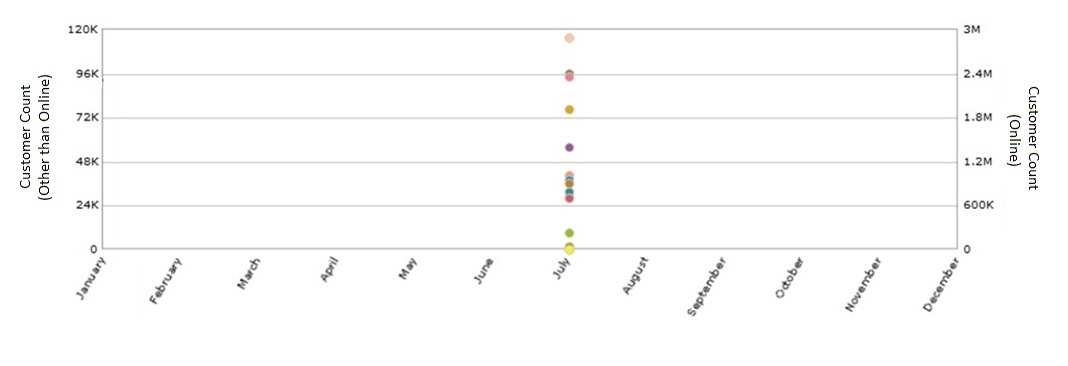
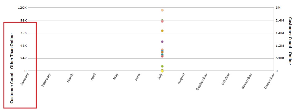
Hi,
one more question. Can the PYAxisName to be wrap text?
Please see the attached image.
Hi,
Yes, it is the only work-around.
-
Hi,
So the only work around are:
1. Align the legend position to right
2. Increase the value of lengendNumColumns attribute.
Hi,
centerYAxisName='0' attribute is supported only in Flash charts and in case you are using JavaScript charts this attribute is not supported.
Chart automatically allocates space for legend and rotated labels at x-axis, so PYaxisName is rendered accordingly. Since this depends on the data you are passing to the chart.
-
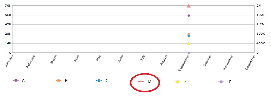
Hi,
Noted.
Your normal is not normal for me.
It is so obvious that the triangle is smaller than the circle one.
It's ok.
Thanks for reply.
Hi,
Legend icons are appearing normal, if you apply legendIconScale='2'.
Please find the attached screen-shot.
-
Hi,
No different.
Please help.
Will You try centerYAxisName='0' once in <chart> element?
-
Hi,
Base on the image I attached, i have increase the legend icon size, i have set legendIconscale = '2'.
But as you see, the circle is look bigger compare to the triangle.
it look like not in same size.
Please help.
Hi,
You cannot increase or decrease one particular legend icon.
However, you increase or decrease the size of whole legend icons using "legendIconScale" attribute.
Please refer this URL, for more information: http://docs.fusionch...esc/Legend.html
-
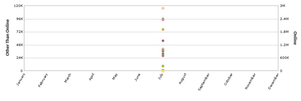
Hi,
Thanks for your reply.
You mention "Chart is calculating the alignment for PYAxisName to be appeared at the center, from the bottom of the legend to the uppermost portion of the chart."
But if I shorten the PAxisName = "Other Than Channel" and SAxisName = "Online", both can be in the center. The PAxisName doesn't look like is in the center from the bottom of the legend to the uppermost porttion of the chart.
Is there any scenario only will happen to render the PAxisName to be appeared at the center, from the bottom of the legend to the uppermost portion of the chart.?
Please see the attached image.
Thanks.
Hi,
Your chart contains large amount of data. Depending on this data legend is also rendered. Also, chart labels are in rotated manner with slant property.
Due to legend icons and rotated (slant) labels, chart is managing space here.
Chart is calculating the alignment for PYAxisName to be appeared at the center, from the bottom of the legend to the uppermost portion of the chart.
Hence, the PYAxisName is getting displayed in this way.
As a work-around, you can align the legend using legendPosition attribute. You can align the legend at the right side of the chart.
Ref. Code:
<chart ... legendPosition='Right'>
And, you can also configure legendNumColumns, with the help of this attribute you can specify the number of columns that are to be displayed in the legend.
Increase the value of lengendNumColumns attribute.
Ref. Code:
<chart ... legendNumColumns='25'>
For more information, please refer the XML sheet of MSCombiDY2D chart:
http://docs.fusionch.../Combi2DDY.html
Please find attached screen-shot of the chart using the provided XML with above mentioned attributes configuration.
-
Hi,
Any update on the issue?
-
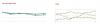
Hi,
I have a line chart with 5 circle point and 1 triangle point.
But the triangle is too small compare to other cirlcle in the legend.
Please see attached image.
How can I make the size of the triangle in the legend same size with the circle?
-
Hi,
I encounter an issue which is when the PYaxisName is too long, the alignment is not nice (not center).
Please see the image below and the XML text file.
Please help.
Thanks.
-
Hi,
anyone can help?
Thanks.
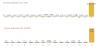
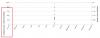
Hi,
Is there a way to fill the anchorbgcolor without specifically set the color code?
By default to have color for the anchor, we set like anchorBgColor='666666' .
How to make the anchor fill with color by the default color when render the chart.
Please see attached image.
Left hand side image, with setting:
<dataset seriesname='Sea' anchorBorderColor='CCCCCC' anchorBgColor='002593' anchorRadius='4' color='0033CC' >
Right hand side without setting:
<dataset seriesname='Sea' anchorBorderColor='CCCCCC' anchorRadius='4' >
I do not want to set the anchorBgColor='002593' because the dataset is dynamic datas. I would not know how many dataset it have.
Please help.
Thanks in advanced.
-
Hi,
The sample code is just simple as the first post.
I can't provide you the whole aspx page, i can only provide you the code which the chart have this issue.
Front end:
<fieldset id="fsTesting" runat="server">
<legend>Testing Stacked Bar Chart</legend>
<center>
<asp:literal id="div_testing" runat="server"></asp:literal>
</center>
</fieldset>
Backend:
DataTable dt = DataTable that return from database
string chart = XML that have been attached in first post
rowCount = dt.Rows.Count;
height = (rowCount * 20) + 50;
FusionCharts.SetRenderer("javascript");
div_testing.Text = FusionCharts.RenderChart("../FusionCharts/StackedBar2D.swf", "", chart, "bar_testing", "450", height.ToString(), false, false);
That's all my code to render the chart.
- I get the row count to dynamically set the height of the chart.
- rowCount * 20 to have each bar same height
- the 50 is for the legend height
Issue facing:
If row count less than 3 rows, it will have the addtional "bar" highlighted in the first post's attached image. If the rowcount is greater than 3, the UI look fine.
Thanks.
Hi,
We need the sample code to replicate the issue at our end.
Please send us the sample code.
-
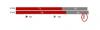
Hi,
I have include in the first post.
Please check the attachment from first post.
Extra info:
For FIreFox v13.0, the UI is more worst, the legend can't view in full (please see the attachment).
Thanks.
Hey,
Can you paste your sample code here? It would be helpful to replicate the same at our end.

-
Hi,
Have you use the code to dynamic calculate the height?
Your attached image is not same with mine. Yours 2 bar is far from each other which i suspect you have put a different height value.
If you use the same logic, the 2 bars should be more close to each other:
int rowCount = dt.Rows.Count;
int height = (rowCount * 20) + 50;
FusionCharts.SetRenderer("javascript");
div_testing.Text = FusionCharts.RenderChart("../FusionCharts/StackedBar2D.swf", "", chart, "bar_testing", "450", height.ToString(), false, false);
Note:
This only happen to data then render less than 3 bars. More than 3 bars, it look perfect.
Please help.
Thanks.
Hi,
We are not able to replicate the same issue.
Stacked Bar 2D chart is rendering fine at our end.
Please find attached screen-shot for your reference.
-
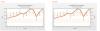
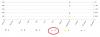
Hi,
I have an issue to show the Stacked Bar Chart correctly.
Please see the attached image, Red marker is the extra 'thing' that appear.
XML have been attached also.
Note:
I would like the height of the chart to be dynamic, so i have calculate the height by the number of row return in the datatable.
DataTable dt = data table return from back end
int rowCount = dt.Rows.Count;
int height = (rowCount * 20) + 50;
FusionCharts.SetRenderer("javascript");
div_testing.Text = FusionCharts.RenderChart("../FusionCharts/StackedBar2D.swf", "", chart, "bar_testing", "450", height.ToString(), false, false);
The "50" is for the height of the legend.
Please help.
Thanks in advance.
-
Hi,
If no sample, how do you know create a function and call in Page_load and Search Button is working?
Hi,
There is no sample for this type of scenario, you would have to write your own logic for this.
-
Thanks for your reply.
Hi,
It was just a work around.
Like I mentioned in my earlier post, it is an intended behavior of JavaScript charts.
For now, there are no known work-arounds, except this one.
I have added your request to our wish list.
It will be implemented, if feasible.
Hope this helps!


Invalid Data When Category Have "<" Symbol
in General usage
Posted · Report reply
Hi,
This is working.
Do you have list of symbols that need to use encoded form in the chart?
I have some doubt why "<" have issue but ">" do not have any issue.
It is good if you can provide list of symbols that need to use encoded form so that my chart will not fail to load suddenly.
Thanks.