
xuen
-
Content count
86 -
Joined
-
Last visited
-
Days Won
1
Posts posted by xuen
-
-
Hi,
Please find the attachment for the XML.
Basically the different is just the <chart> element's properties setting and the date range.
For first question's "Top image have setting:" xml, refer to text file "1.Top image have setting.txt"
For first question's "Bottom image have setting:" xml, refer to text file "1.Bottom image have setting.txt"
For second question, 1 month date range's xml, refer to text file "2.Both line chart have the same setting(1 month).txt", which show the label step correctly.
For second question, 3 months date range's xml, refer to text file "2.Both line chart have the same setting(3 months).txt".
Hi,
It would be easy for us to work out if you can please provide us the XML data.
Also, please let us know the version of FusionCharts that you are currently using.
Please mention the height and width of the chart.
With regards to,
3. Is it possible to customize the line chart base on the date range? Refer to image (Day Month.jpg)
>> I am afraid, FusionCharts does not support any manipulation functions or attributes that manipulate data.
FusionCharts Suite is the most comprehensive data visualization solution for your web and enterprise applications but not a data processing software like other BI tools.
Hope this clarifies.
Awaiting response.
1.Bottom image have setting.txt
-
Hi
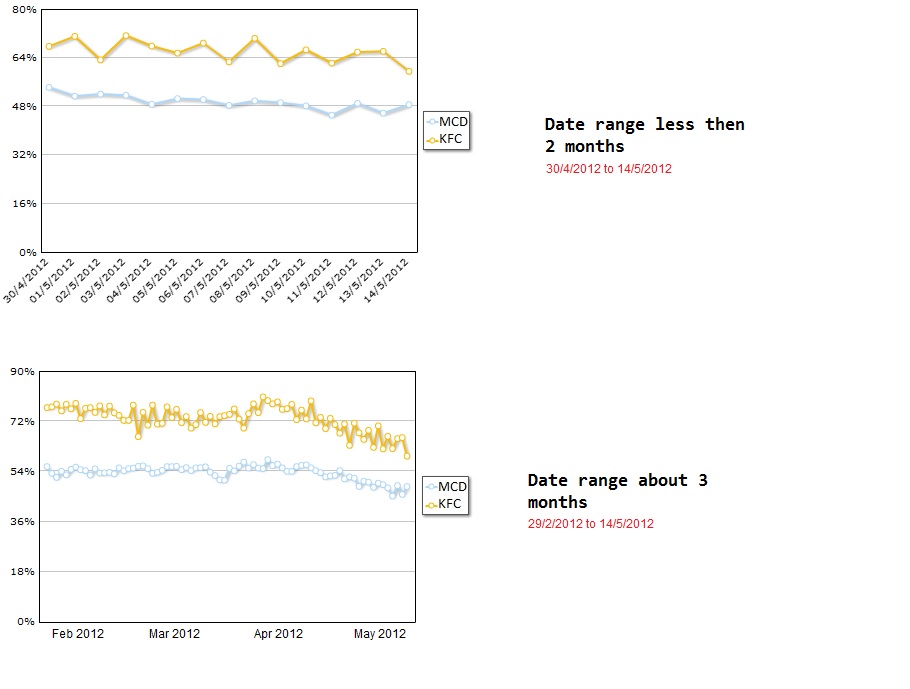
I have few question about the line chart.
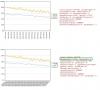
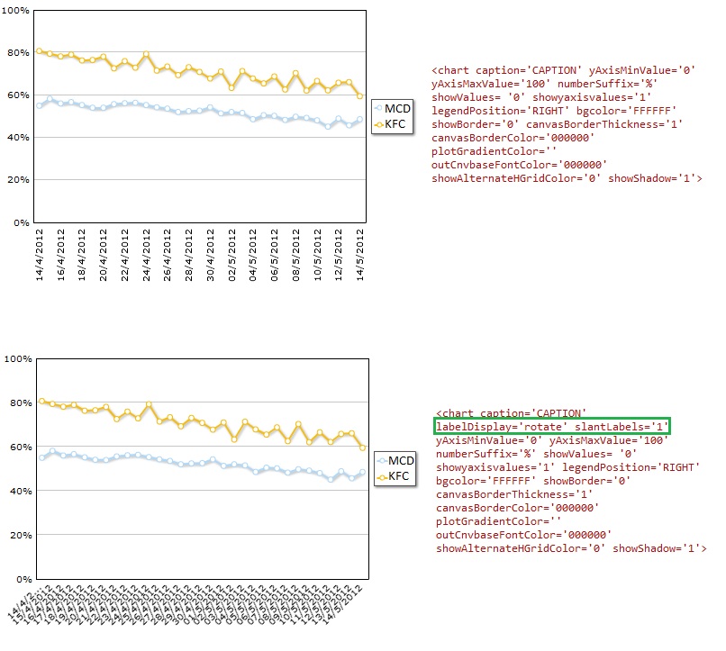
1. I have 2 line chart with below setting, refer to image (LineChart.jpg). Want to know how is the x-axis label display work? Why is top image show thedate label every 2 days but the bottom image show date label everyday?
Top image have setting:
<chart caption='' yaxisminvalue='0' yaxismaxvalue='100' numberSuffix='%' showValues='0' legendPosition='RIGHT' canvaspadding='8' bgcolor='FFFFFF' showBorder='0' canvasBorderThickness='1' canvasBorderColor='000000' plotGradientColor='' outCnvbaseFontColor='000000' showAlternateHGridColor='0' showShadow='1'>
Bottom image have setting:
<chart caption='' labelDisplay='rotate' slantlabels='1' yaxisminvalue='0' yaxismaxvalue='100' numberSuffix='%' showValues='0' legendPosition='RIGHT' canvaspadding='8' bgcolor='FFFFFF' showBorder='0' canvasBorderThickness='1' canvasBorderColor='000000' plotGradientColor='' outCnvbaseFontColor='000000' showAlternateHGridColor='0' showShadow='1'>
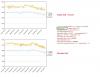
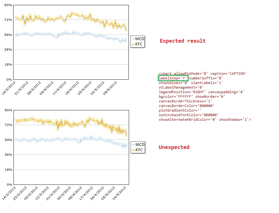
2. The labelStep property is not working properly. Refer to image (LineChartLabelStep.jpg).
Top image able to show the date label every 7 days which is set in the chart element (date range is 2 months).
Bottom image is showing date label every 9 days which is an unexpected result. (date range is 3 months).
Both line chart have the same setting (labelStep='7' ):
<chart allowPinMode='0' caption='CAPTION' labelStep='7' numberSuffix='%' showValues='0' slantLabels='1' xtLabelManagement='0' legendPosition='RIGHT' canvaspadding='8' bgcolor='FFFFFF' showBorder='0' canvasBorderThickness='1' canvasBorderColor='000000' plotGradientColor='' outCnvbaseFontColor='000000' showAlternateHGridColor='0' showShadow='1'>
3. Is it possible to customize the line chart base on the date range? Refer to image (Day Month.jpg)
For example:
If the date range is less than 2 months, the chart show day at x-axis label
If the date range is more than 2 moths, the chart show month at x-axis label. Note: I would like to remain the day point plot at the chart, just the x-axis label change to monthly.
-
Hi,
The issue solve?
Can anyone provide the solution?
I also looking for similar solution, which I have too many point in the chart and label of X-Axis. i would like to remain the point at the chart but at X-Axis label, show month only.
Is there a solution for dynamic X-Axis label?
I have on my page a zoom line. I have maximum about 700 points on it. (One for each day for a period of 2 years.) Because it's a lot of points, he groups some of those days, so if I stand on one part of the graph it will show me that the change in the line happens on 3-5-11 while the actual date is 2-5-11. Is there any way to show the actual date? (Look at image to get example.)
The second thing is: there are too many labels on the X-axis. Can I limit the amount of labels to, say, 24?
Thanks in advance!
-
Hi,
Is it possible to only hide 1 of the button?
Example, I want the Zoom Out button to be visible but Reset Chart button invisible.
-
Hi,
i have try with the trendline work-around.
It is not working.
The line is not show is the value is less than 1.
Please help if you have other solution.
Thanks...
Hi,
The trendLine applied in the above XML code is a work-around to have a border at the bottom.
You can have multiple trendLines on your chart.
It is not possible to add border on left-side and right-side of the chart.
Hope this helps.
-
Hi,
I cannot use <trendLines> to archive what i needed because my XML already have the trend line element as average value for the chart data.
Any other solution for this?
Also i would like to show bottom and left border for other chart.
Any solution can easily archieve both situation?
Hi,
To achieve this, you would need to modify your XML code accordingly.
Please try following XML code.
Ref. Code:
<chart yAxisMinValue='' showlimits='0' showValues='0' showPlotBorder='0' canvasBorderAlpha='0' bgAlpha='0' bgColor='FFFFFF' numDivLines='0' showBorder='0' plotGradientColor=''>
<set label='Jan' value='420' color='AD1F1F' />
<set label='Feb' value='420' color='AD1F1F' />
<trendLines>
<line startValue='0' color='000000' displayvalue=' ' />
</trendLines>
</chart>
Also find attached screen-shot your reference.
Hope this helps.
-
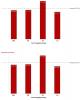
Hi,
Please see the attachment.
The top columnChart show after i have remove the border.
What i want to archive is remove the border except for the bottom border show in the bottom columnChart.
Hi,
Can you please elaborate your requirement, a bit more?
Can you send us a screen-shot of the same?
-
Hi,
I'm looking for the solution of showing only bottom border.
Do you have your solution already?
Can anyone guide on how to do this?
Hi,
We are a licensed user for Fusion Chatrs.
We have a requirement to hide Top and Right border for all the charts in our IPad applications (Javascript renderer)
Can you please let us know if there is any way for achieving this.
Appreciate the quick response on this.
Thanks,
Upendar
-
Hi,
It is working.
Thanks for help.
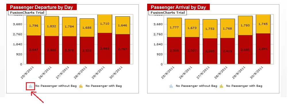
Hi,
Please try setting the color in the <dataset .../> element.
Ref. Code:
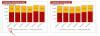
<dataset seriesName='No passenger without bag' color='B40404'>
Please find attached sample screen shot.
Hope this helps !
-
I have a stackedColumnchart and i want to customize the color set of the Column and also the legend icon color.
After i set the custom color for that set as show below:
<set value='2300' color='B40404' />;
the legend icon color is still the default color.
please see attachment for sample.


Set Amout Of Labels And Points On Zoomline
in XML Issue
Posted · Report reply
Thanks for the reply.